03 November 2022
Microinteractions examples that make your desktop content beautiful and useful on mobile too


Contents:
Micro-interactions are small details that make the user’s contact with an electronic device smooth and effortless. As a staunch UI evangelist, I agree 100% with that statement. I think designing micro-interactions is part of the UI process since it’s based primarily on aesthetics of performance that increase the overall user experience. Today I will show you some microinteraction examples that help transfer content from desktop to mobile in an effective and lossless way.
The main problem? Working area
Desktop width starts at 1920px, while mobile defaults to 375px. This is a big difference in display capacity, and the content must match both. Of course, UI/UX designers and researchers interpret content transfer as they like.
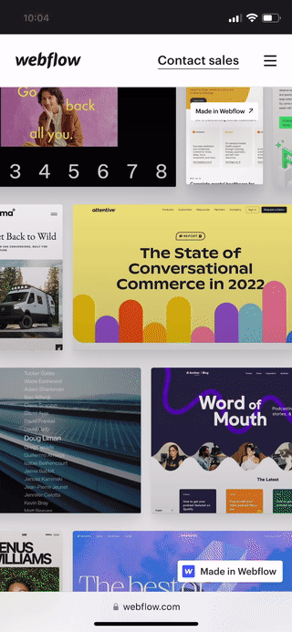
I’ll give you two examples of trendy platforms: Fiverr and Udemy. We’ve got a search bar and a nice picture in the hero section. Depending on your designer, it will go either way – you can remove/hide a hero-image like Fiverr.com (the priority content in this section is the search engine, which is clearly visible in both cases), or transfer the content 1:1 like Udemy.com did (both search bar and the picture are there).
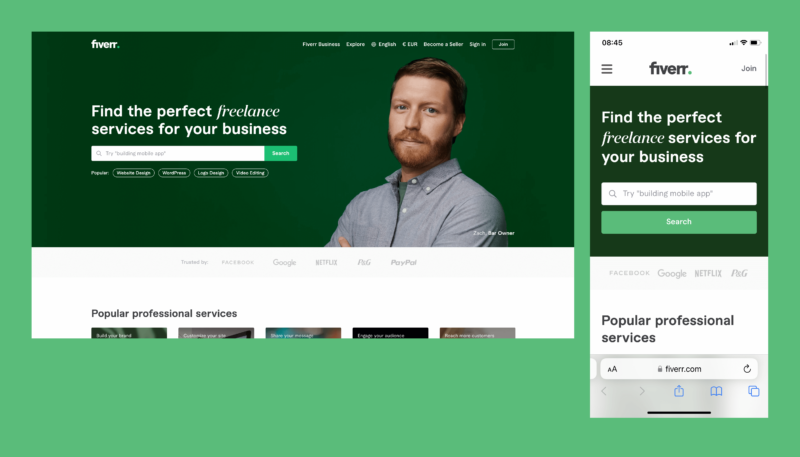
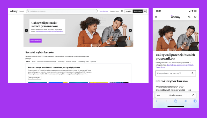
Who’s right here, Fiverr or Udemy?

We live in times of “mobile first”
The mobile version must be a mirror image of the desktop, there’s no way to take shortcuts here. Just check out the graph below.
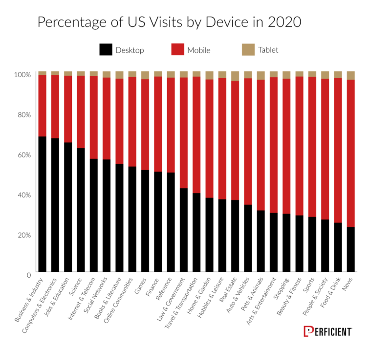
Already in 2020, nearly every single industry had at least 50% of its traffic from mobile devices. Various studies show that as of August 2022, 62.06% of all website traffic comes from mobile device users and 92.1% of internet users access the internet using a mobile phone. Nowhere to run, nowhere to hide from mobile.
This means that currently mobile is the dominant technology in the digital world, and not the “nice to have” feature, as only a few years ago. In addition, Google, through its “Google Mobile First Indexing” program, strongly promotes and gratifies the mobile approach when it comes to SEO, and thus business issues.
Well-structured information architecture – case study
The most important task when transferring content between desktop and mobile is to keep all content at both break points, even at the expense of a different composition of individual components.
By “composition” I mean establishing a well-structured information architecture (hierarchy of information). The priority content must be visible immediately, then secondary, and tertiary content (often a trigger is needed to reveal it).
In the first case, you can make some concessions during the conversion, although according to many it is an unforgivable sin against good UX design practices. However, when it comes to complex digital e-commerce products, marketplaces, and service platforms, it should rather be avoided.
Or shouldn’t it?
Let’s take a look at Spotify and its “Popular” section on artists’ profiles.
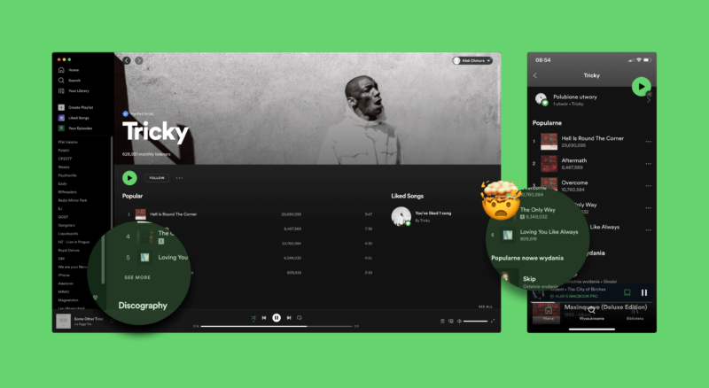
The first most popular songs are visible in the desktop version. Another five are hidden under the “see more” button (so that’s our trigger). On the mobile, you have only five songs available, with no option to expand the list. Why is that? Honestly, I have no idea.
All I know for sure is how to fix this UX calamity with a simple micro-interaction.
Solution? Micro-interactions transforming content
The Spotify problem can be easily solved by micro-interactions, more specifically, the aforementioned trigger that reveals hidden content. A simple, mobile link-button used in the desktop version just begs to be placed at the bottom to reveal the other five songs.
Thanks to micro-interactions, browsing mobile content, apart from being easy and accessible, is also fun and engaging for users. Therefore, it is worth looking at them from a broader perspective. By default, micro-interactions are rather visual (animated loading screens, error messages, fireworks hearts on Tiktok, etc.) but in this article, I approach the topic on the usability level.
I’ll show you how micro-interactions non-invasively help in squeezing content from the desktop to the mobile version, and at the same time, simplify the interface so it’s not overloaded with content.
The Spotify example is cool but let’s look at more possibilities micro-interactions offer.
Looking for more product design content? How about...
- Follow my wireframing examples for thorough design planning, and you won’t end up with an unsuccessful app
- The best prototyping tools are more or less the same. Pick ones that fit your project and team
- Design discovery phase. Establishing what your users want equals moving forward with successful apps
Use micro-interactions to solve the most common usability problems
1. Left/right swipe
Classic. You will not only reduce the height of the mobile page by swiping a specific section left or right but you can show additional options available under hidden buttons.

2. Compressing long tables into expandable tiles
Tables… one of the main nightmares of designers. Due to compressing the rows of tables into interactive tiles (often with an implemented accordion), content that is too wide for the screen is nicely snug in form of a mobile tile.
3. Holding a button shows additional options
Gain access to contextual options that are usually visible on the desktop but need to be hidden, or contained on the mobile version to achieve a more compact feel and look.
4. Clicking a tile shows additional content
With this option, you intuitively compress the desktop content to a smaller form while keeping the content 1:1, simplifying the interface and enriching the overall user experience.
5. Hamburger menu
Last but not least, the classic number two – hamburgers. Adjusts the entire menu to mobile, making the navigation compact and easy to find by users.

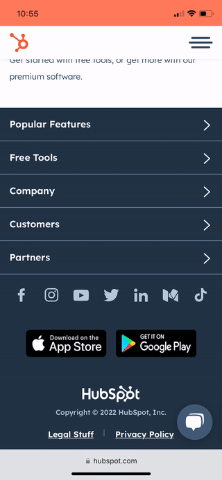
6. Shorter footer
This is the last one I promise. Let’s check how brilliantly Hubspot decreased the size of a really tall footer by using mechanics similar to the one from the hamburger menu. Absolutely stunning approach to content transformation.
The usability aspect of micro-interactions is not only an invaluable help in maintaining content consistency on both desktop and mobile. It also improves the user experience and engagement by introducing mechanisms to simplify the app’s interface on a small smartphone surface, and additional graphical and interactive aspects. Useful and fun can go together.
Using micro-interactions kills three birds with one stone:
- thanks to the compatibility of desktop and mobile content, Google will index the application better, which is a massive advantage for business (your marketing is gonna love it),
- simplifying the mobile interface is very handy for good UX/UI practices – smaller screen area, more compact view. Kudos to the designers for creating a simple, undemanding, and pleasant app.
- useful can be pretty! Introducing interactive sections significantly improves the overall look and feel of a digital product. Not to mention better user engagement!
Thank you for your attention!
We've already moved tons of content from desktop to mobile, can we offer some advice? 📲
We know how difficult is to choose what’s coming and what’s going when creating mobile versions of desktop apps. If you wanna talk and get more info out from our Product Designers, give us a shout by booking a free 1-h technical consultation. No strings attached!
