02 June 2022
Follow my wireframing examples for thorough design planning, and you won’t end up with an unsuccessful app


It makes no sense to start decorating your apartment when all the construction details are not yet determined. It may turn out that your bed will block the balcony door or you won’t have access to electrical sockets where the TV should be. No, this is not an excerpt from Bob the Builder’s help book. It’s one of my favorite wireframing process metaphors I use to explain the potential dangers of omitting what is commonly known as wireframes (or mockups) in Product Design. Nice aesthetics of digital products are important but they must be preceded by thorough planning and modeling of the architectural blueprint – the app’s foundations and functionalities.
Wireframing – designing the content and structure of websites and applications
Wireframing is a part of UX design in the software development process, where you determine the information architecture, and content of your mobile app, landing page layout, or any other project, in terms of usability and information structure necessary for user-friendly operations.
Wireframing fall in the product development process in an early UX stage, right after collecting all the necessary information in the Design Discovery phase. Usually, it’s done simultaneously with the very first mood boards (collages of colors, images, text, and other composition samples).
What should be included in the app wireframe? Examples
- a simplified version of the content layout on desktop or/and mobile views,
- only necessary details, as you don’t want to distract people from the most important features in the visual hierarchy,
- a high-level user flow that allows eliminating all kinds of pain points the entire way from start to finish,
- information organized into high-level architecture guarantees properly designed navigation, so users don’t get lost in the app.
I will talk about the benefits of wireframing in more detail later. Right now I’ll just underline that people often want to omit sketching wireframes because they feel that it’s just an additional cost. Nevertheless, this stage should not be treated lightly! A wireframe is a “project of a project”. Before you start beautifying the design with perfectly tailored typography, iconography, or a color palette, you must first focus on content.
You should start wireframing rather early in the design project because this stage is prone to constant changes. I’m talking basic structure of content, information architecture, responsiveness, and the visual hierarchy of the display. So there will be quite a lot of iterations based on various factors, e.g. user interviews, competition analysis, and feature brainstorming.

If you want to know more about how to acquire, establish, and generate ideas, my colleagues Magdalena Habarta and Małgorzata Owczarzak-Ryng, have described the design discovery phase with truly surgical precision here:
INB4: Wireframes are NOT prototypes
While we’re at it, it is worth mentioning one important issue – wireframes are not prototypes.
The main difference between a wireframe and a prototype is that wireframes are used to determine the content and structure of the website/app, while prototypes are primarily used to test whether the previously made decisions turned out to be correct. Prototypes, that are most often based on a ready UI, provide much more immersion and a “feel” of the product to the test users, and as a result, the design team obtains more valuable feedback. Wireframes are blueprints for the content structure.
In short, use a wireframe to set the content foundation. Then color in the UI design to check and test the app’s success with test users by using interactive prototypes.
I’ve written an article about prototyping rules and tools, so give it a go for a full picture:
Wireframe examples & types
There are two main ways to create wireframes, depending on the complexity, level of detail, user flows – low-fidelity wireframe and high-fidelity wireframe. Each of them is used to identify and design different content details. So let’s see how they will influence the final design of your own project.
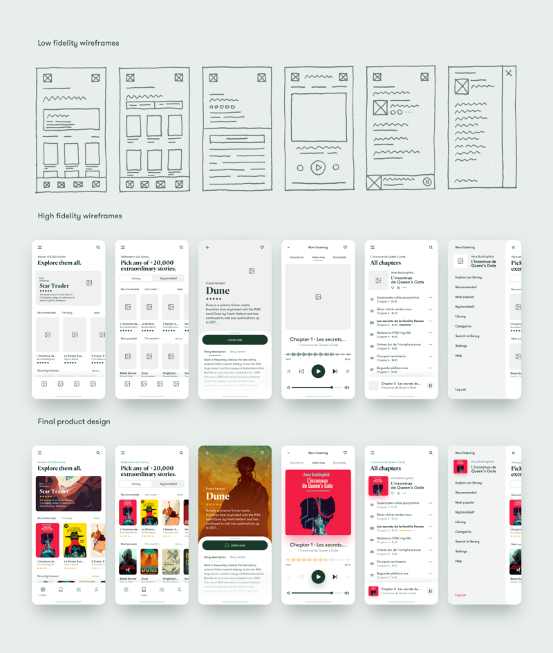
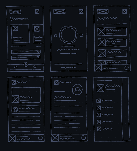
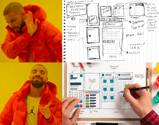
Low-fidelity wireframe
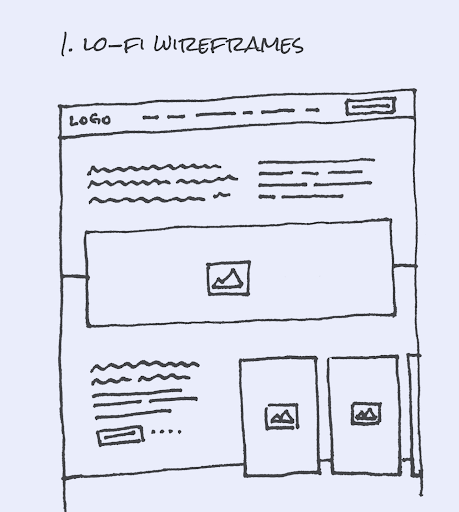
In the early planning phases, the design evolves so quickly that a low-fidelity wireframe is the simplest visual design possible. Most often I use the most ordinary pencil and paper wireframes to roughly outline the structure of a view and then, if necessary, quickly apply any corrections.
Let’s say you’re building an e-commerce platform, so you need to determine how to present your products. Will a simple slider showing two, three, or maybe four products in one row be enough? Or maybe the shop is so vast, that you need to design multi-level navigation?
Lo-fi wireframe allows you not only to quickly visualize an idea, prepare and edit a specific user flow, but also to design a foundation for content.
Personally, I prefer this approach because it allows me to conduct the design process away from the keyboard and prepare materials to document the entire design path from beginning to end.
With a low-fidelity wireframe, you can do quick iterations and concept changes, even during meetings with the shareholders. The entire wireframing process is carried out smoothly without wasting time waiting for back-and-forth feedback.
Of course, low-fidelity wireframes aren’t necessary for every project. When you need to outline a grid system or design complicated navigation. it’s possible to do with pencil and paper but it will probably kill a lot of trees (and your sanity) in the process, so it’s better to rely on wireframing tools like Figma.
There are also scenarios where you can omit the low-fidelity phase, for example, a relatively simple landing page/one-pager with little navigation and/or a simple grid. Then you can jump straight to the high-fidelity wireframe zone without any major obstacles.
High-fidelity wireframe
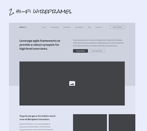
In the case of a high-fidelity wireframe, you need to use one of the wireframing tools – Figma, Sketch, InVision, or whatever else you prefer.
Personally, I try to create high-fidelity wireframes in a way that they become the basis for the UI phase. I’ve noticed that this approach has a lot of advantages:
- the image of the final product begins to form from the very beginning,
- consultations with shareholders are easier because they can see the material, focus on the structure, and provide constructive feedback,
- it may seem that high-fidelity wireframes with quality components are time-consuming but in the big picture, every minute spent on proper wireframing will save you hours in the later stages of the development process,
- it’s a matter of time before you will develop a wireframing pattern that will speed up the process (e.g. by reusing more common components in subsequent projects).
In my opinion, the most important benefit of high-fidelity wireframing is efficiency. You gain a stable foundation for designing a clean and aesthetic user interface without wasting time on rebuilding the entire content structure from scratch.
In most cases, the high-fidelity wireframe that the designer created digitally is an absolute “must-have”. However, there are exceptions where you can skip it:
- Adding new features to an already existing application, e.g. an online shop acquires new products, and you need to update the filtering options. There’s no point to wireframe the entire app from scratch, you just add the necessary elements.
- The application has the design system in place, and additional features can be prepared in the blink of an eye based on ready-made components, no need to wireframe the entire view.
Wireframes work towards beautiful user interfaces
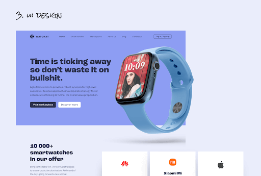
A beautiful UI like this wouldn’t have been created if it hadn’t been for the two previous stages, i.e. determining the high-level structure of the grid using low-fidelity wireframes that were then improved with a more detailed content layout, such as navigation, typography composition, and pictures that are part of high-fidelity wireframes. Then you deal with the User Interface, and how the final product is supposed to present itself.
I don’t need any wireframes. What could possibly happen?
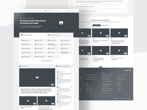
Let me start with an anecdote from my own experience. I’ve worked on a price comparison website but I was introduced to the team after the project had started. To my surprise, the first thing I learned was that there are no wireframes because the client refused to get them done. When I inquired why wireframing was omitted, I was told that it would unnecessarily extend the development process. And that designers and developers cooperate nicely, so there was no need for wireframes.
I was horrified! A massive comparison platform with over a million unique views per year is not a showcase website. Somehow I managed to convince the client that wireframing will bring a broader perspective that significantly will increase the chances of successful results after the platform’s release.
The client reluctantly agreed, and I got to work. The first thing I touched on was the main user path, the spine of any tech product. Lo and behold it turned out that, according to the collected data, the user path doesn’t start on the website’s home page, but in the Google search engine (because the entire website relied heavily on SEO). Therefore, we had to plan and manage the entire user flow in a way that the list of financial products was basically the main page where the user started their adventure.
If it wasn’t for this discovery, there would be a considerable risk related to the subpage with the list of offers. In turn, that would have a negative impact on the conversion, and thus the business side of the product. In other words, the entire website wouldn’t (and couldn’t) work as the client wanted in the first place.
Why it’s not worth omitting website wireframe design?
I’ve worked for a lot of people who didn’t have the opportunity to be involved with the textbook software development, so everything before the User Interface phase seems a waste of time and money for them. So I’m not surprised that you might be wary of “extra curriculum scams”.
Designing digital products is a more complex process than providing pretty screenshots in the first week. If you don’t have the experience you might be shocked how much time and effort is put into the initial planning phase. Especially when it comes to applications/websites with large budgets that expect a significant ROI.
It’s easier to explain/understand difficult issues with wireframe examples
Developers aren’t always able to reasonably and logically explain the complexities of individual stages and support them with specific case studies that were successful or not. Tech is difficult, and a wireframe example can work miracles in finding the common ground.
I often explain the app’s responsiveness on many different devices on a wireframe supported by hard data on the behavior of modern users.
Wireframes will check if you distract your users
Do you want your users to reach a happy destination in their digital journey (meaning: buy your products/services)? Then don’t distract them.
Wireframes are a great tool for setting the right hierarchy of content to lead your users to conversion goals without turning their attention elsewhere. So many things can ruin your conversion rate, so wireframing allows you to see all user flows, and remove any obstacles waiting for your users.
A good wireframe shows (not) accessible architecture
Thanks to wireframes, you clearly see the info architecture and are able to make the application meet the accessibility standards. Otherwise, you might be even exposed to unnecessary financial penalties for negligence and digital exclusion.
You only get one chance to make a first impression
Watch out, sometimes product designers assume that wireframes don’t have to be “pretty and aesthetic” because the content is what counts. That’s a disrespectful and sloppy approach to the project. People are usually visual learners, so well-prepared and presented materials are a much better starting position in establishing designs. As you probably know, the first impression can only be made once.
Nobody (developers, test users, or stakeholders) must get the feeling that designers were playing with crayons and sticky notes. Otherwise, it will be impossible to effectively convince anyone that the presented approach is the correct one. Therefore, make sure to notice the visual side of the presented materials from the very beginning.
As you can see, without incorporating wireframing into the design process of a website or application content, you risk a lot. I’ve already seen examples of ill-considered or untested content decisions that made the most beautifully-looking apps virtually impossible to use or completely incomprehensible to the average user. And you know what happens when users struggle to use your work-of-art app? They will uninstall it, choose alternative options instead, and may not ever come back.
Benefits of wireframing
So, what makes wireframe design so worth the additional effort? I’ve divided the benefits into three groups.
Benefits for the shareholders:
- Easy insight into the entire design process to control the resources, allocation of time, and financing.
- In case of any iterations, changes can be made quickly on-demand.
- Active participation in the design process, not just receiving dry updates.
- The certainty that the final product will meet the expectations of end-users.
Benefits for the developers:
- Content is well-planned and arranged into an information system according to user feedback collected in the discovery phase. This ensures appropriate UX good practices, e.g. compliance with accessibility, well-designed and clear navigation, eliminating pain points, and work towards understandable UX writing.
- Information architecture is based on and adjusted to accessibility requirements.
- The ideal tool for user testing since limited details allow users to focus on core functionalities. If you test user flow for basic functionality like adding a product to the cart, wireframes allow you to fully check this particular process without distractions.
- Every person is on the same page. Any new developer introduced to the project will gain full knowledge of the app’s architecture in no time. This limits the unnecessary questions and doubts during the implementation process.
- Responding to technical issues on an ongoing basis. This saves so much time when designing difficult elements, that otherwise would be impossible to implement due to time/budget/technical limitations.
- From my personal experience, developers can provide A LOT of genius ideas or predict potential problems just by analyzing the wireframes. So keep them close from the very beginning of your project.
Benefits for the users:
- Application based on design discovery will be tailored 100% to your users’ needs. No fluff, no unnecessary features that waste everybody’s time, and your money.
- The user journey is clearly paved, so the navigation isn’t confusing for the new users – easy to use and understandable enough so it won’t fry their brains.

Great wireframes = healthy project
Going back to the opening analogy of this article – first, you need to build foundations, put up the walls, and only then pick the paint color and hang up bookshelves.
This is basically the essence of wireframing and an absolute “must-have” in the modern approach to the design process.
Thanks to the wireframing stage, your application will not only look good but also work properly in terms of user experience, making users fall in love with your app. Not because it only looks nice on the outside, but due to the availability and functionality tailored to their individual needs. And that’s what makes users stay with you for longer.

