11 February 2021
Metrics in optimization process: Grafana dashboard tutorial (4/4)


You may already know how important it is to measure the performance of your app, or even how to integrate with tools such as Prometheus. But if you can’t visualize your data in an easy-to-read and organized manner, you won’t get much out of it. There’s a cool, open-source tool for that. In the last part of the Metrics in optimization process series, we’re teaching you how to create a dashboard in Grafana, so that you can produce a new dashboard that even the business department will follow.
What you will learn here
In the previous three articles, we talked about why you should measure your app’s metrics, how you can integrate it with Prometheus and how to go about collecting statistics.
Since we have now a lot of data to show we should think about the presentation layer. The true purpose of it is to present data in a way that gives us what we need, rather than just as a disorganized pile of trash. It will not just make pretties, but also far more useful. Another important thing is that the data, which we collected with Prometheus, doesn’t have an easy-to-read format. Today it’s time to show ugly metrics data in a beautiful way.
As you know from previous articles, we collect data from Kubernetes and our application. We are going to show an example of how to configure a dashboard, what is important, and why we did it this way. We are not going to show and describe all options in Grafana, just the ones that we needed to configure our charts (hey, it’s a crash course, after all!).
Kubernetes dashboards
Since we have already covered a lot in previous parts, it’s a good idea to sum up what we have now. With that, we can create our own custom Grafana dashboards.
Kubernetes has many user dashboards of its own that track our resources. With the cluster created and Prometheus integration out of the way, it’s good to explore them.
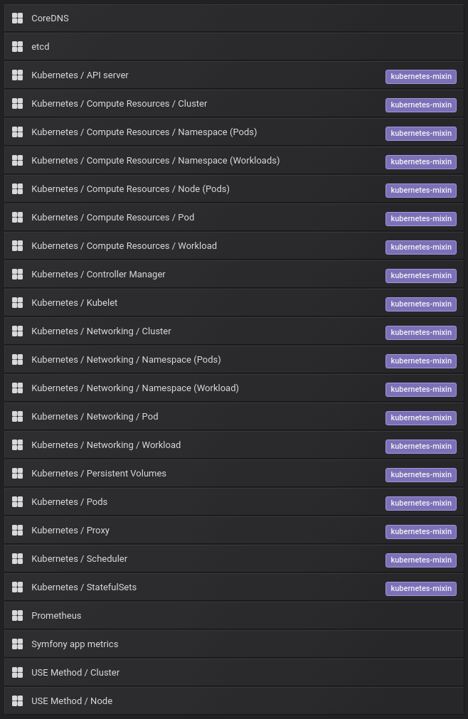
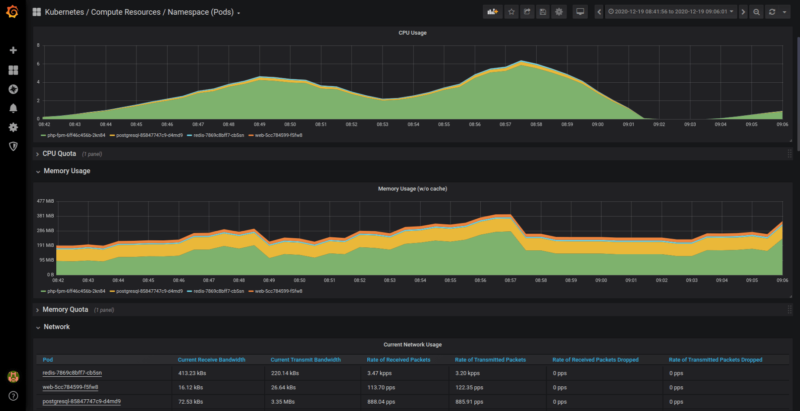
As you can see, it is quite a long list of datasets. We don’t want to get you bored with descriptions of every dashboard, metric, and all the panels provided. Let’s focus on “Kubernetes / Compute Resources / Namespace (Pods)”.
This dashboard version logs information about CPU, memory, and network usage. These pieces of information reveal if the last optimization helped or if the deployment added some particularly “heavy” scripts.
How to make Grafana dashboards
Save this page in your bookmarks, as we’ll stay here for a while. We should have many custom dashboards to accommodate each statistic that we need. A good practice is to not include too much input in a single dashboard – it will be hard to read and understand. What’s more, the loading time for that page may explode.
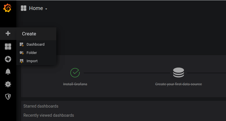
To create a dashboard, we need to choose the “+” option on the upper side of the left sidebar. Next, let’s click on the “Dashboard” option from the drop-down menu in the corner.
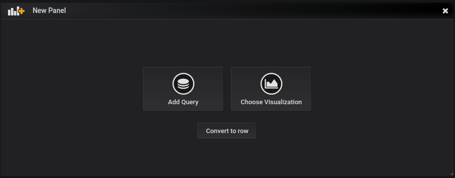
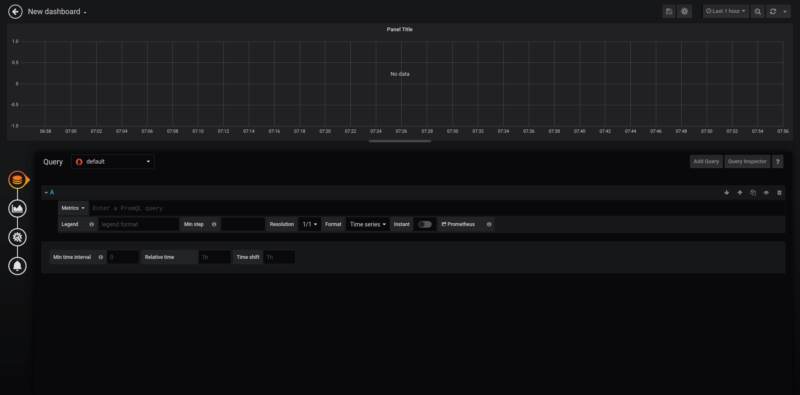
Grafana gives us two starting points – chart type or data. Usually, we want to use default charts, but it’s good to try all the different settings. In our case, we are going to create a default chart by selecting “add query” option.
 A visualization of our selection
Here comes the trickiest part – we need to define WHAT metrics we want to display and HOW we want to show them.
Here are the user options you need
First, we need to discuss the specific options to understand how everything will work:
- Chart – this is where we are going to vizualize data.
- Query – should be onfigured as PromQL by default. If it’s not, please change it to the “Prometheus” option.
- Add query – we can create more than one data source for one chart. It’s useful when we need to show a new statistical source but we want to keep the old one.
- Query inspection – our debugging tool to improve the experience when we need to find a problem with a query.
- Query box – a place where we define what data source we’d like to see.
Displaying registered information on a dashboard
Metrics – we use them to choose the data for monitoring. Here, we collected “app_request_execution_time_seconds” so that we can search for this metric. If the application hasn’t collected a particular type of data, it will not be on the list. Remember to run any endpoint in your app first to generate a minimum amount of data. In our case, “app_request_execution_time_seconds” is a histogram.
Prometheus logged three elements:
- Sum – a summary of logged information from our queries
- Count – counted data.
- Bucket – if we configured buckets, we can use them to approximate data.
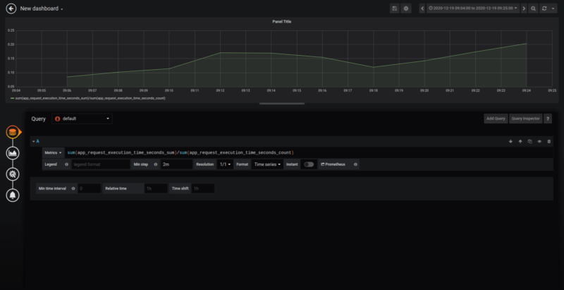
In our example, we are going to show execution time per request by using “sum” and “count” to prepare what we want to see.
The easiest way to display that section is to write:
“app_request_execution_time_seconds_sum/app_request_execution_time_seconds_count”.
Unfortunately, in real project situations, that might be not enough. Usually, we have many pods that collect data, and we want to see and analyze data per routing.
First, we need to use the “sum” function which will add up information from different pods:
“sum(app_request_execution_time_seconds_sum)/sum(app_request_execution_time_seconds_count)”
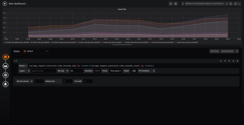
But now we can only see one element instead of all the routings we called! To fix this problem, we are going to need to group our metrics using “by (label)”:
”sum(app_request_execution_time_seconds_sum) by (router)/sum(app_request_execution_time_seconds_count) by (router)”
Congratulations! You configured your first chart with metrics!
Still, it’s not a pretty view. We can see the “ugly” routing labels instead of clear user output.

To fix this problem, we need to declare data in the “legend” field. Just put ”{{router}}” and it’s done.
In the previous article, we learned to collect data for specific periods, so we need to put the correct “min” step (in my case it will be “2 min”).
The final query setup:

And that’s all! Now you can see the proper metrics:
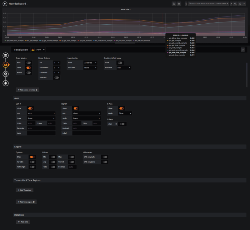
Viewing multiple endpoints
In the example application which we created for this article, we have only 8 API endpoints. Everything is easy to read. The problem starts when we have 50 or more endpoints for our data source.
Time to improve our visualization. We need to move to the second tab. Here, we can change our chart type (in our case the best one will be “graph”).
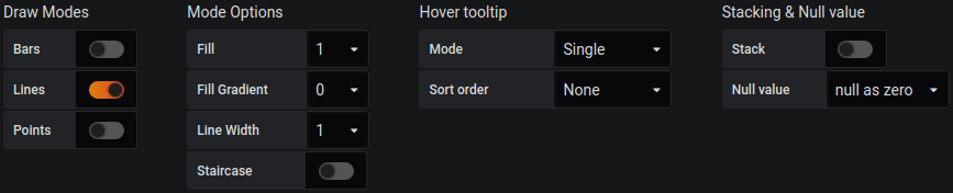
Using Grafana draw modes
Most options depend on our visual taste. I like defaults, so I will stay with it.
There are only two related options that improve visibility that I want to mention:
- Null value – we want to see data even if the value is zero, so I will change it to “null as zero”.
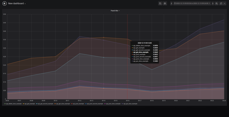
- Mode – when you point to a specific chart element, you will see information about all endpoints within a specific time range. If you want to see the highest time, change it to “single”.
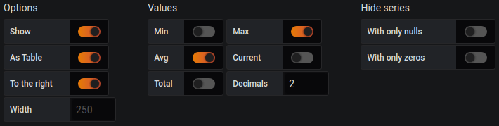
Look into the legend section to set custom options
Grafana dashboard legend
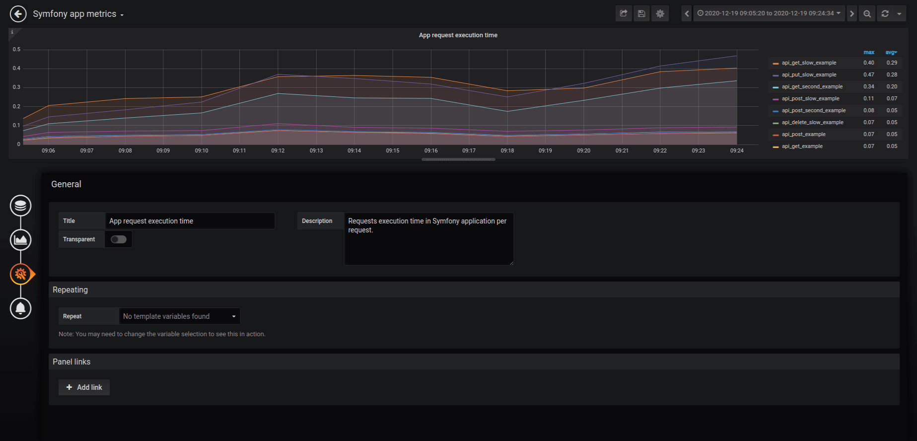
The current legend doesn’t look good. We want to see everything as a table to improve visibility. As far as values are concerned, the most useful statistics are the average and max peak. For some statistics it’s good to set decimal to a more general value (we changed it to 2) as we are not interested in thousands.
The interface after changes
Grafana dashboard thresholds
Thresholds are a very nice feature that helps us find data that is greater/lesser than a specified value. With thresholds, it’s much easier to find routings to optimize.
As a first step, we want to know which endpoints are slower than 0.3 seconds. We will see it easily when we configure thresholds with “gt 0.3”. In a real project, we suggest setting it to 1.0 seconds.
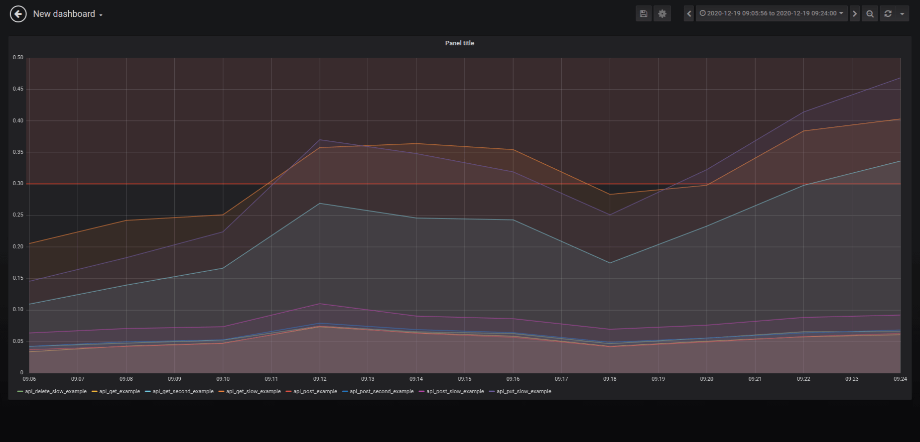
Threshold settings
General options
Title – the name for our new Grafana chart should be short and sweet – e.g. when we log the execution time in an application, we can set it as “App request execution time”.
Description – a place when we can put more information on why and what we show.
General options
That’s it. Our new chart is now configured. We can save it. It will redirect us to the new dashboard with the first chart. In our case, we needed to repeat this process for each piece of information.
Grab the Grafana repo from this tutorial
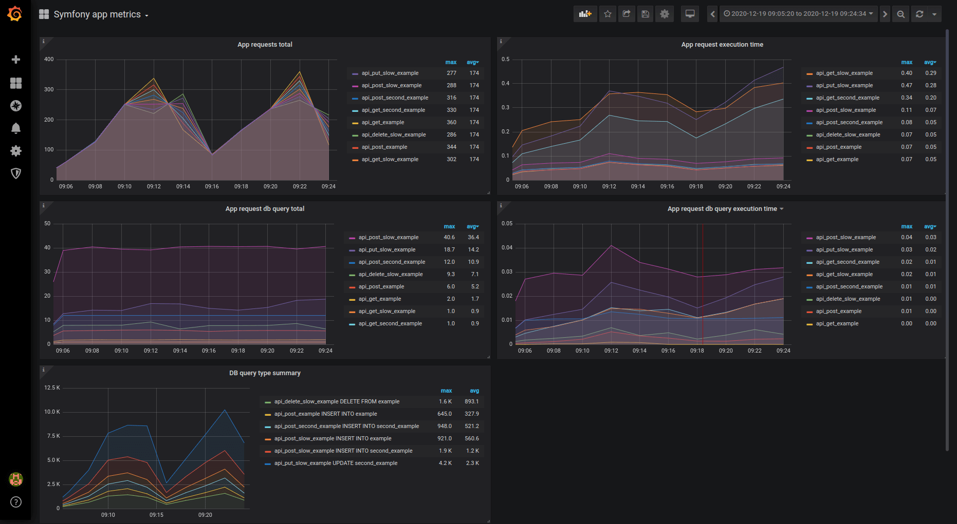
The full setup is available in this example app repository. The visualization will look like that:
What you’ve learned about Grafana
As an open source tool, Grafana helps us visualize and understand what happens in the software:
- It provides information on actions increasing/decreasing speed and resource utilization.
- It makes it possible to prepare a business report about progress.
- With alerts, it’s easy to get information that something is wrong.
Life with all this information on multiple graphs is so much easier!
The optimization process is a long journey, which is hard to accomplish without additional help. It’s important to define goals and analyze exactly what should be measured. We needed software which will help solve problems. Here, Prometheus was the best tool for us. It delivered necessary information and provided integrations with many programming languages and Kubernetes out of the box.
With a deep understanding of how data collection and presentation layers work, it’s easy to extract practical information from an application. Our presentation comparing app performance before/after optimization made the business department really happy (thanks for the charts, Grafana!). It also helped introduce an overhaul, after which end-users stopped complaining about loading speed.
Finally, it made us happy as developers, because we could find out exactly how our changes affect the system.
And if you are searching for a team that knows how to optimize application performance, saving your precious time and resources in the process, contact The Software House. 👇

