07 October 2022
All about UX writing – How to create intuitive content that people want to read


Contents:
Originally published at bluerank.com on July 14, 2021.
The sheer number of websites, apps, products, and services that we have to deal with today means that we need proper guidance in the form of useful and intuitive text content. UX writing is all about providing highly informative content. Combined with the ever-improving accessibility of digital platforms, you can use it to reach out to all kinds of audiences.
Today, I’m going to show you how to create UX copy that can do just that.
UX writing – What is it?
UX writing is about creating intuitive content that guides the user through a page or app. It’s a set of communication techniques that make it easier for users to learn and complete key objectives on their customer path. UX writing, also referred to as UXW, UX copywriting, or UX copy, lowers the risk of producing hard-to-understand content that often makes a user leave your website altogether.
Good UX copy doesn’t bring attention to itself. The user simply uses the page or app without any issues. They know what each button, form, or suggestion means. They know what to do in order to achieve their objectives and find helpful information. Consequently, improving your writing leads to a better user experience.

UX writing strongly depends on your content strategy. It also has a lot of touchpoints with UX research (e.g., usability testing, A/B tests) and design. A UX writer often works alongside a UX designer. As a result, the copy is provided at the design/mockup stage. It makes conceptual work easier, allowing for adjustments to the amount and structure of copy with great precision.
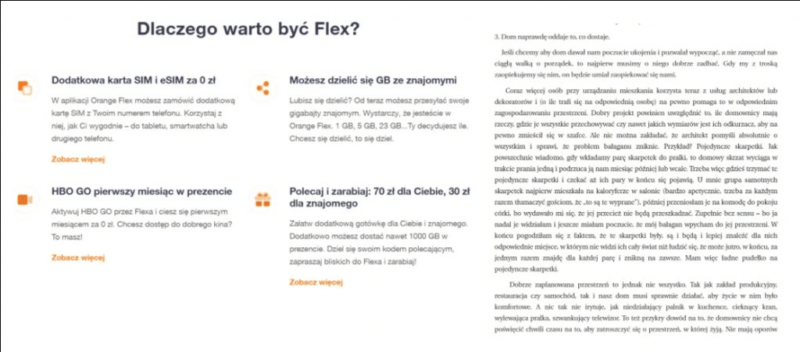
Can you see the difference? On the left-hand side, you can see an example of good UX copy from Orange Flex. On the right, there is no UX copy.
How quickly are you able to find your passenger seat number? This PKP (Polish abbreviation for the Polish State Railways) ticket is a prime example of how not to write UX copy.

Where and how to use UX copywriting
Employing UX writing makes sense whenever you communicate to a mass audience. The internet may be the first thing that comes to your mind, but the same is true for information booklets, leaflets, posters, or tickets.
Typically, UX writing is associated with web application copy, including web forms and error messages. It’s the best tool at your disposal when you need to explain complex processes in a concise and accessible way.
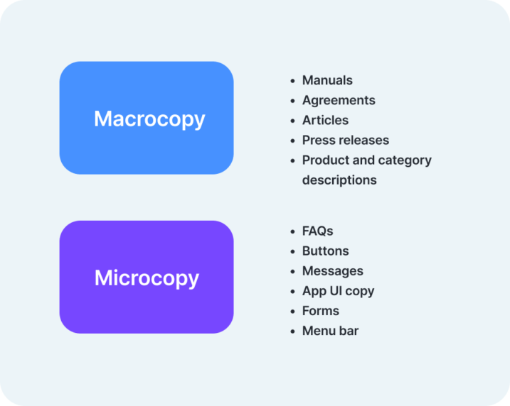
UX copy is often divided into microcopy and macrocopy.
Microcopy refers to a variety of very short forms:
- Buttons
- Forms
- Menu bars
- FAQs
- General messages
- UI text that is short and clear by nature
Writing highly condensed copy that comprehensively conveys a lot of information in 300 words can be more difficult than producing a big 800-word article. Weighing each word in order to get the maximum effect in communication, and guiding the user, and meeting conversion goals in the process is the very essence of microcopy.
Macrocopy, on the other, hand alludes to longer content forms such as:
- Articles
- Press releases
- Product and category descriptions
- Instructions
- Agreements
UX copy is not all about apps and forms. Long content forms such as articles, instructions, or agreements also need to be intuitive. Some best practices are quite well-known, such as using h1, h2, and h3 headings to organize the content, bolding the most important information, or employing bullet points for clarity. The number of words in a sentence as well as the length of a paragraph are also important. All of these techniques help organize the content, making it clearer and more scalable, and thus, more user-friendly.
Banks and government institutions have also begun using simpler language. UX copy has found a place in written summaries of legal disclaimers, as recently proven during the release of Cyberpunk 2077. On the left side, you can see the original license agreement, and on the right side, there’s a user-friendly equivalent for the average Joe.

Do you want to create user-friendly micro- and macrocopy? Check out the article: Content – is it worth it? And should I do it myself, or hire an agency?
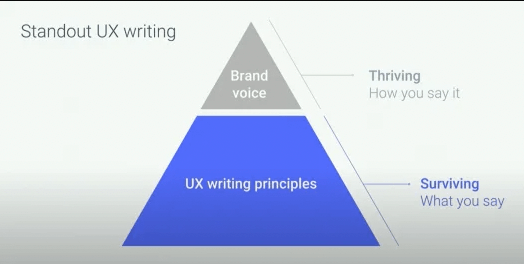
The rules of UX writing – What does Google recommend?
UX-conscious content is helpful, concise, and simple. Its quality is ensured by following the EAT (Expertise – Authoritativeness – Trustworthiness) framework. In addition to that, it features a well-planned presentation and layout, good accessibility, simple language, and brand voice, as well as consistent vocabulary. Let’s review the four most important conclusions expressed in WCAG guidelines and Google recommendations. You can think of them as the rules of UX writing.
Digital accessibility – WCAG 2.1
WCAG (Web Content Accessibility Guidelines) is a set of web page accessibility recommendations. All pages and mobile apps of public institutions need to be accessible, and they can’t exclude any social groups. This is confirmed by the 2012 Digital Accessibility Act.
WCAG guidelines describe the optimal structure of websites and apps that ensures the best accessibility for everyone, including people with visual and hearing impairments, physical and learning disabilities, and mental disorders. These guidelines make it easier for everyone to use the internet.
WCAG 2.1 is the latest version. Its guidelines are founded on 4 principles: perceivability, understandability, operability, and robustness.
What can you do to make your content more accessible? The following recommendations will help you reach the widest possible audience and make your content easier to understand and scan.
Digital accessibility & content visibility
For the visually impaired:
- Use proper meta titles and descriptions – They should contain the title of the page and article, followed by a dash and the website name.
- Take care of the heading structure (h1 for the title; h2 and lower for headings) – They should describe the content of corresponding paragraphs. A good heading structure serves as a helpful table of contents.
- Provide alt text – Images are inherently inaccessible as they are difficult to interpret. Alternative text explains the contents of an image, making it possible for the visually impaired to get an idea of what is shown on-screen.
- Set proper page contrast – It makes the page easier to read for everyone. WCAG recommends a 7-to-1 contrast ratio. You can calculate it using a color contrast analyzer tool.
- Use a readable sans serif font and responsive design – The former refers to a web page’s ability to adjust its content to the screen size.
- Offer the ability to increase the font size (aAA) and view an alternative page version – Key page elements such as an internal search should have good visibility. You can improve it by offering the ability to increase font size at the click of a button or by providing an alternative page version.
The hearing-impaired:
- Provide video subtitles and transcription for audio content such as podcasts.
For people with physical disabilities:
- Offer keyboard-based navigation – Some users are not able to use a mouse due to various disabilities. The visually impaired also use the keyboard rather than a mouse. Digitally accessible pages should provide alternative navigation based on keyboard keys such as TAB and SHIFT + TAB.
For people with learning disabilities:
- Breadcrumbs are a type of navigation that help organize your content in a logical way. Memory and attention disorders can make it difficult to use a website. Good content layout and helpful copy go a long way to help the user achieve their objectives on the page.
- Error messages should suggest a solution.
- The content should be aligned to the left rather than justified. It’s easier to read for people with dyslexia.
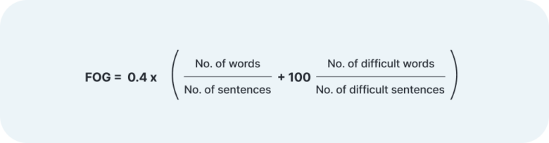
- Provide helpful content – It should be simple and concise. Tools such as Hemmingway or the Polish Logios and Jasnopis use the FOG index. This is a readability measure. It allows you to calculate the approximate level of education required of the user to understand given content. Different types of content (e.g., instructions, B2B articles, guides) are expected to have different average difficulty levels. For simple content, the optimal value is 8. The higher the number, the more difficult the text is. Such tools can be helpful, but their results need to be put in a proper context.

Inaccessible websites, unclear messages, and other unexpected difficulties prevent the user from making a purchase. According to a report by the Polish Consumers’ Association, Poland is one of the EU countries with the highest rate of digital exclusion – 4.5 million people have never used the internet.
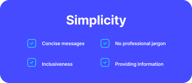
Simplicity
Accessible content should be simple. But what does this really mean?
Concise copy
Wherever possible, use a period rather than a comma to keep your sentences short yet concise. According to Nielsen Norman Group research, users typically read only about 20-28% of the words on a given page. As a result, short sentences (up to 20 words) and brief paragraphs (up to 6-7 lines) make a difference. The user can easily identify and focus on the most interesting parts.
Concise copy = easier translation
Simple and short content is practical and easy to translate. Language localization, that is, adapting content to the cultural context of a given country, is easier as well. Some languages (e.g., German) can cause up to a 40 percent increase in the number of words when translated from another language. As you can imagine, using a machine translation service or even professional translation can make the page difficult to read.
Concise copy makes your content easier to understand and to translate.
Professional jargon and specialized terminology
It’s vital to avoid, or else properly explain, overly complicated terms. This has to do with the curse of knowledge – a situation where a knowledgeable individual assumes that other individuals also have the same knowledge. As a result of such a bias, companies produce complicated product descriptions, overly elaborate reports, unintuitive manuals, and other inaccessible pieces of content. Buffering, rendering, or authentication – You can use these terms, or you can go for something more common.
Inclusiveness
Inclusive language is accessible and easy to understand for everyone. How do you use it? It’s recommended that you avoid using masculine pronouns when speaking to a general audience. What’s more, you should use the present tense and refer to the person that performs a given activity accordingly. When possible, it’s good to use female equivalents of traditionally male nouns when referring to women. Alternatively, you can use neutral forms.
Using the masculine form in the UI often misses the context. As an alternative, you can use gender-neutral language.
Providing information
The user should instinctively know what’s going to happen next when they start a new action by clicking a button, opening a new tab, or clicking the “more” hyperlink to see the full content. To achieve this, you should provide intuitive button copy, clear form labels, helpful error messages, or user guidance by color. You should also consider enriching your written content with infographics, tables, and bullet points.
Tone of voice – proper brand communication
Adhering to the aforementioned best practices is the foundation of UX copy. To take it a step further, you also need to develop your own unique approach to communication, which should include specific expressions, tone of voice, types of content, and even a set frequency of content production.
Creating well-structured copy is one thing. Giving it a unique feel consistent with your brand image is another.
According to Google, brand voice generally doesn’t change over time. It has very specific attributes (e.g., helpful, simple, fresh) which are used consistently across communication channels.
However, the tone of voice changes with the context. It has to take into account a specific task performed by the user or the emotions they feel (e.g., when they encounter an error message). Typically, when the user starts a new action on the page, the language should be positive and exciting. On the other hand, error messages are not the best context for making jokes. A helpful, concise, straight-to-the-point message is what most users expect.
Tone changes over time in order to reflect what users do and experience. At the same time, it needs to be consistent with the overall brand voice.
Learn more about tone of voice and UX writing from this Google I/O presentation:
How Words Can Make Your Product Stand Out (Google I/O 17)
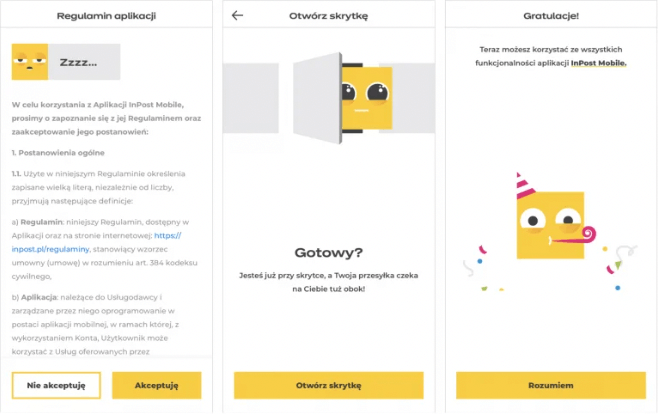
Both the voice and tone of your brand have to do with branding, that is, your choice of typeface, key visuals, or color palette. When your content is consistent with both brand voice and visual style, you’re on the right track. See how InPost is doing just that:
Tone of voice – Android app example
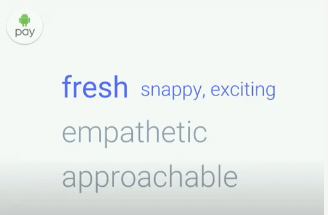
While working on the tone of voice of Android, the team at Google created a style that had the following attributes: evident, clear, concise, and helpful. The brand voice was to be characterized by three more adjectives: fresh, empathetic, and approachable.
Their research, which included a semantic analysis, led to the development of Android’s unique communication style. It’s easy to follow and concise, but at the same time it clearly stands out from other Google products.
Tone of voice – Smart & Mercedes example
Both Mercedes and Smart belong to the very same company. However, their brand voices are very different, because they target different audiences. Smart’s brand may include adjectives such as agile, expressive, dynamic, fun, or friendly. As for Mercedes, descriptors include words like precise, luxurious, stylish, efficient, or engineered.
Style guide – It’s all about consistency!
A style guide is an organization’s way of establishing best practices of writing and content formatting. The development of a semantic dictionary that includes the brand’s preferable words and expressions allows for consistent and unique communication.
When included as part of a brief, a style guide is essential for content creation, including blog articles, sponsored articles, promotional campaigns, and the development of new products such as apps. With the help of a guide, the buttons responsible for a given action will have the same name across the entire system (e.g., preference for the word “start” over “click”).
A guide also includes information about typography, logo, colors, and other elements related to the visual layer.
If you want to meet Google’s UX and SEO requirements, use the SXO audit and optimize your website to make it more user-friendly.
Conclusions – Why is UX writing so important?
UX writing is more than just creating intuitive, simple, and helpful content for the user. UX copy matters for both the audience and your website itself.
- Google Page Experience Update 2021
UX writing guides the user through the page, eliminating the feeling of uncertainty.
Google prioritizes user experience. The June 2021 update of its algorithm emphasizes page speed, security, mobile experience, and above all, good UX. Factors such as page layout, typography, contracts, and UX writing strongly influence the user’s behavior on the page. They may be helpful in performing given tasks, or instead, they may introduce confusion and uncertainty. The result of the latter is a high cart abandonment rate and bounce rate. Eventually, the user will simply find a different page that provides a better experience.
Also check out: Core Web Vitals – essential web metrics
- Polished microcopy and CTA increase conversion rates
Did you know that Android reported a 12-percent increase in button clickthrough rate when they changed the button copy from “add a card” to “begin”? Good microcopy, such as the text of buttons, menu items, and forms, has a great impact on user experience and conversions. UX writing establishes a conversation between the user and product, improving the overall user flow.
- Unique voice for your product
According to Google, good copy is the foundation, while adding brand voice and tone of voice to the mix allows you to stand out from the crowd. UX writing can give a unique voice and character to your products.
- Social changes – Banks and government institutions unite for simple language
UX copywriting and simple language are increasingly becoming the standard in apps and websites. Public institutions modify their content to make it more accessible. A recent example is ZUS (Polish national Social Insurance Institution) and their new message regarding a sickness allowance. Another interesting development is the common declaration of banks on simplifying banking language, making it easier for individual consumers to understand.
As you can see, UX writing and simple language greatly improve user experience. You can come across examples of it wherever there is a mass audience to communicate with.
Sources:
Zarządzanie treścią. Strategie i narzędzia, Meghan Casey
Microcopy: The Complete Guide, Kinneret Yifrah
Nielsen Norman Group
WCAG 2.1.
Google I/O ’17 – How Words Can Make Your Product Stand Out
Google I/O ’21 – Material’s communication principles: Intro to UX Writing | Workshop
