01 June 2021
Should you use universal design principles in product design?

Here’s a fun fact — architectural design sets the most important usability rules for digital products. While business is concerned with functionality that generates revenue, users are ready to buck in only when the experience of using software is satisfactory. Product designers must find the middle ground by following the seven timeless principles of universal design.
I assume that many of our readers have been on remote work for a year. It was a time of a boom in software sales as companies purchase new productivity tools, as confirmed by a recent McKinsey report noting that software adoption sped up by several years during the pandemic.
It’s a good moment to consider why a company chooses one digital product over another.
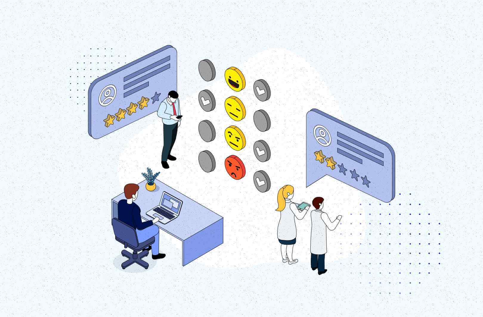
If you’re from a company that sells digital products to unsuspecting Linkedin users, remember that software with a smooth user experience has better user retention. Now, when hundreds of companies earn from our forgotten subscriptions, we’re starting to understand why Apple — or even the Xiaomis of this world — obsess about design principles.
Allow me to demonstrate why digital products that are supposed to hit Spotify’s adoption level must follow the rules of universal design for consumers to open up their wallets.
It’s a colorful theory, I agree. But how true is it?
Startups prove the product development paradox
It’s been another year for me of hearing that functionality beats usability, so that’s where the resources must go. If you agree, here’s something that might change your mind.
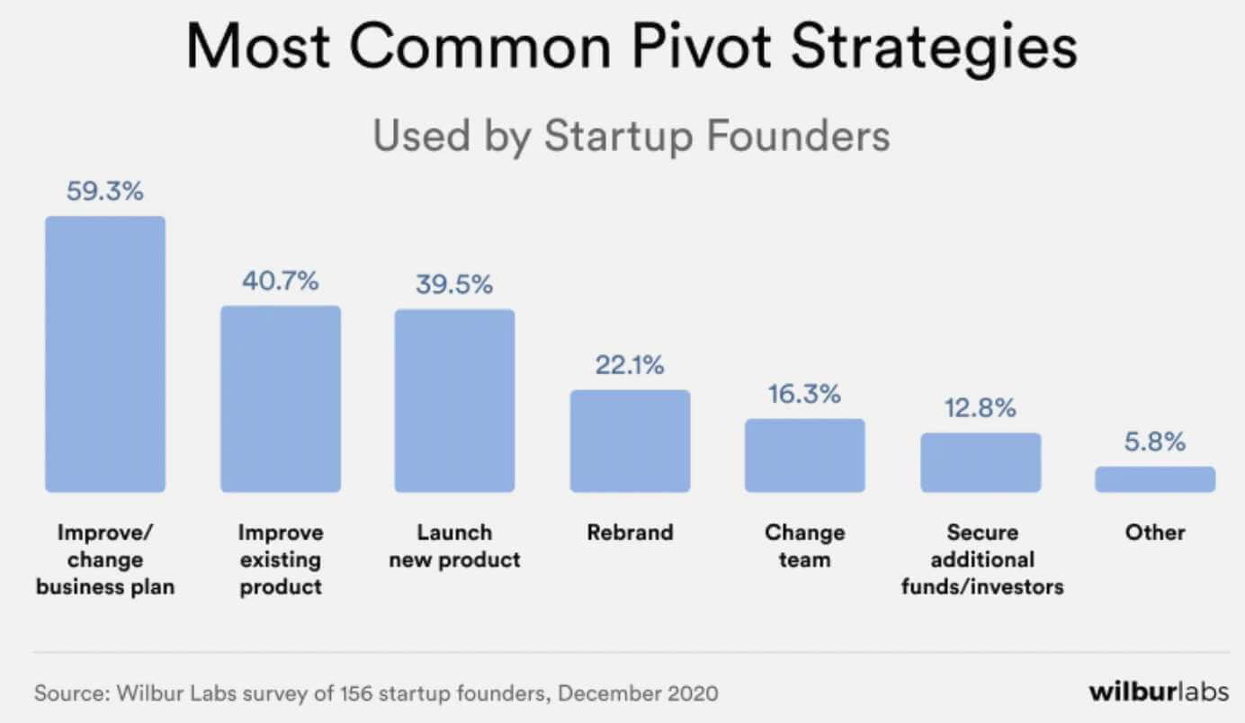
Startups are known for stretching software ideas to the max. Looking at the numbers behind a study of 165 founders’ strategic thinking, you’ll notice a peculiarity.
- Most founders admitted startups go broke because they spend too much
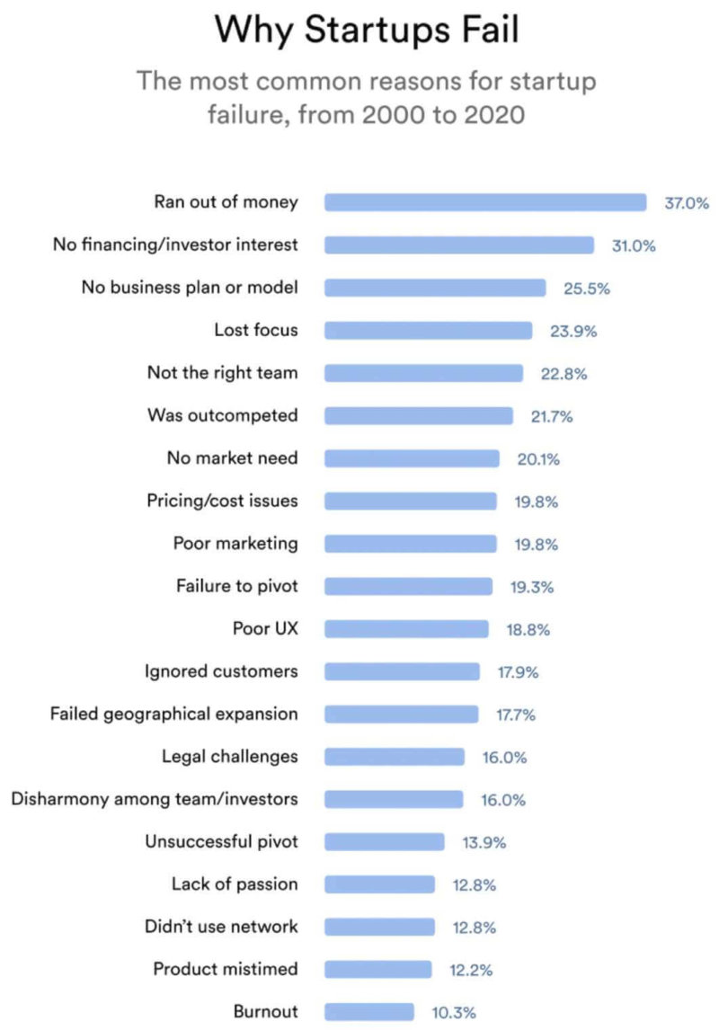
- When asked what a startup should do to pivot (as in: to try a new growth strategy), over 47% of them suggest… upgrading the product.
Hold up. So when their cash is burning, they’d rather level up the product instead of cutting down on spending?
The explanation is that we choose software because of its functions, but we continue to use it if the work experience feels right.
Simply put, a digital product with outstanding design will make you better bucks.
First, know what digital product design is
You can build apps with varying precision, depending on how they need to work, look, and feel. The domain of digital product design defines these three categories through rules for the design and development of web/mobile apps and e-commerce stores.
Product design has two areas of work — UX (user experience) and UI (user interface) — that are responsible for how we interact with software. Designers like me have a sacred duty to ensure the user’s interaction remains strictly positive.
To build applications that people can’t get enough of (hello, Netflix), our work focus is mostly set on the rule of accessibility and user-centered design, which we’ll explore further on.
Successful products respect universal design
You might not notice it daily, but a lot of digital product design rules are the same “analog” concepts architects use. One of them, an accessibility advocate named Ronald Mace, coined the term Universal design for a set of basic design principles used to engineer objects and places that we can use by intuition.
Mace understood people are different, but they show similar behavior in specific situations. In his opinion, design projects should consider shared behavior so that the largest group of people knows what to do when faced with things like scissors, a wheelchair, a steel pot, or an elevator button.
It is quite often that designers disregard universal design principles because of project limitations or time constraints. Unfortunately, such deviations lead to what’s called “forced adaptation”, where the user rages at the unintuitive design that contradicts their past usage experience.
We’re talking about these doors you were sure needed a push, but once you slammed into them, it turned out you needed to pull. Maybe it was you, or maybe the handle was that confusing.
Universal design might have started with architects but was later adopted by other professionals such as industrial designers and digital product designers. While on the surface it just might seem noble to be inclusive for people, accessible products and objects creating a positive experience encourage more and more users to adapt them.
The 7 principles of universal design that you’ll discover now define a way but not the law. Instead of maximizing usability, you’d rather follow them to increase it, because rarely a product serves 100% of the customer base. The goal is rather to satisfy a very precise group that has the highest conversion potential instead of everyone in the pipeline.
💡 QA and Design professionals are you best friends
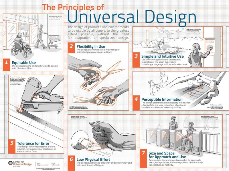
7 principles of universal design, explained
What follows aren’t textbook definitions created by a lonely professor in a vacant lab, as Mace always saw design as something collaborative. He worked with a strong team of other architects, product designers, environmental engineers, and government regulators to great success.
In 1973, Mace’s and his band’s know-how led in part to the adoption of the first accessibility-focused building code in the U.S., which was based on an early version of the rules that follow.
1. Equitable use, meaning: similar experience for all
We should be able to use the product in the same way, regardless of who we are or our disability. The assumption here is that people don’t want special treatment even in case of cognitive disabilities, because that could make them feel marginalized.
Real-life example
Automatic sliding doors used in office buildings, shopping malls, or hospitals. The in-build sensor activates them whether you’re a person on a wheelchair or a parent with a baby resting in both hands.
Digital use example
Nearly identical design of the default buttons for accepting/rejecting a call. They’re big with recognizable colors and icons that remind us how analog phones were used. The answer button’s always on the left with reject kept on the right.
Thanks to this solution, smartphone makers don’t exclude people with daltonism or vision impairment, who should have an easier time operating this screen.
Source: Giphy
2. Flexibility in use, meaning: everybody can do it
The product should remain usable in as many potential scenarios as possible. Consider what will happen if the user interacts with the product in different spaces (laptop in direct sunlight) or with different tools (opening a milk bottle with a wrench).
Real-life example
Did you know: scissors are ok to use for left and right-handed people.
- Digital use example
iPhones 8 and below have a hidden “handle” above the screen. When dragged down, it lowers on-screen elements like icons or the hamburger menu. Now things are easier to click if you work on the phone with just one hand.
Source: The Software House
Full-width buttons are another smart example of the principle. Because they’re easy to click with either of the hands, left or right handed people use them the same way.
3. Simple and intuitive design, meaning: it just work
How the product works should be simple to grasp regardless of your experience, knowledge, language proficiency, or focus level. You don’t want to think about it where there’s an immediate job to do.
Real-life example
Road signs or information boards using similar pictograms. Yeah, you have to remember them. But once you do, you know what’s up in seconds.
Digital use example
The contrasting red/green call buttons from earlier are an obvious example of simplicity. For a similar reason, hyperlinks at best should be in blue with an underline to be unmistakable.
Design recommendations for app/website/tv digital menus demand the utmost minimalism to prevent users from getting lost. If the user can’t go through it with conviction, you might even lose sales.
Source: Giphy
So in any menu, link copy should be clear and distinct, so that you won’t access a page by mistake. At times, you might see bolder labels like “Previous” or “Next” that lead the user on. UX designers might also use animation for an entry to help us refocus and suggest we’re about to switch the page.
See why one Saudi Client redesigned their marketplace in line with universal design
📊 While their spot for freelancers and SMEs had around 23,000 monthly visitors, many creative projects were getting dropped halfway.
Learn what our product designers — Aleksander (the author) and Magda — did to save the marketplace’s conversion numbers.
And then, there are animated onboarding screens, which you’d like to provide for anything people might find unusual. Think of a new software tool you’re trying the first time, where an onboarding intro teaches you how to proceed.
4. Perceptible information, meaning: make things clear
Feedback from the product should be understandable under most environmental conditions for users with high and low cognitive abilities. Effective prompts use visual, spoken, or sensory information in response to your action to guide you in any ongoing process.
Design decisions can’t always rely on each prompt type. So far, digital products rarely use sensory feedback other than light, unless you count in your phone’s vibration mechanism. We might see VR evolve in the future to a level where you will feel textures through the product’s gloves. This could work well as a “try before you buy” function for retail brands in 2077.
Real-life example
Keypads for most ATMs have big numbers (visual) and bumpy Braille blips for the blind (visual). On press, they light up to communicate what you pressed, and beep to confirm if your input is correct or wrong.
Digital product example
Notifications from Siri are both visual and verbal just in case you’re off your phone for 10 seconds.
Source: Giphy
5. Tolerance of error, meaning: I get it, but no
In Poland, we joke that when people stomp out a path next to a sidewalk, somebody underestimated what they can do for convenience.
A part of a designer’s job is to predict what actions a user can take that deviate from the product’s intended use. For instance, in some places, you can right-click to access advanced commands, and in others, you can’t. We also introduce such precautions to prevent the user from putting their job — or themselves — at a risk.
Real-life example
You must remove the safety pin before using the extinguisher.
Digital product example
Source: iOS
It can be an annoying confirmation prompt that saves you from deleting files, or an undo prompt that lets you stop an email from being sent.
6. Low physical effort, meaning: don’t bother me
If you have several competing products, the comfort of use might define who gets the most of the market. Lightness, compactness, or foldability are the qualities we often desire in a product because we purchase them to support us in what we do. Low-effort design cuts down on task completion time and the required input energy (like an electric toothbrush) to increase the chance for repeated use.
Real-life example
One of the two triangular elevator buttons — more can cause problems.
Digital product example
The three default movements used to navigate mobile/web applications: up and down scrolling; left and right swiping; and tapping that often only needs the thumb (it’s good to have one). That’s all you need to float away on your phone without effort.
Mobile technology has even more hacks we can use like pressure-based touch input or pinch-zooming with our thumb and index fingers. Still, these functions have found little popularity.
Source: The Software House
7. Size and space for approach and use
Although this rule doesn’t translate directly to the digital domain, it’s still a good reminder to remember that different customers might approach our product. For instance, the design of physical spaces might consider height, body type, readingand hearing ability, which are traits that might affect the visual design of our application.
Real-life example
Decent door or passageway width that allows two-lane walking, luggage carrying or moving in a wheelchair.
Digital product example
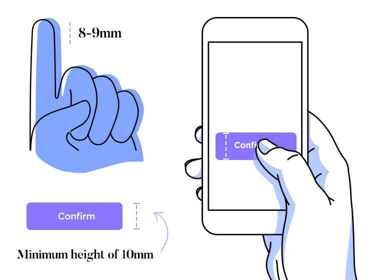
Arranging the size of visual content that is big enough for the visually impaired but doesn’t bother the non-impaired. Industry standards recommend buttons of minimum 50px in height, 16pt for text size, and a strong background-to-foreground contrast ratio.
Source: Giphy
Universal design does contribute to revenue growth
Ronald Mace and his engineering and architectural collaborators pioneered modern usability that moved product design from a state of “it works” to “it’s pleasing to use”.
Many modern brands like Zalando or YouTube that tailor to international audiences comply with the rules the group set to reach greater success with their products. That might even mean generating nearly twice the revenue that competitors reach.
That is, however, a practical assumption. It is up to the designer to make a bet which usability features must apply to an app in development from their previous experience.
Knowing the universal design principles by example will broaden their intuitive understanding of design decisions that are optimal for the project.
As a next step, I’d encourage you to dive into this collection of 195 design case studies. With facts from the UK’s government, Airbnb, Asana, or BBC, you’ll understand much more about people’s expectations towards digital and analog products.

