24 July 2023
Why and how to make images responsive? A complete guide to improving user experience and scoring well in Lighthouse


Contents:
Responsive images are used in virtually every web-facing application The Software House teams create and publicly release. Used to optimize the applications’ speed, responsive images improve the user experience across the Internet. Additionally, we increase SEO and improve user conversions. So, if done correctly, responsive images have a positive impact not only on the app’s user satisfaction but also on the owner’s business.
I have always felt that responsive images are not sufficiently explored anywhere. I have studied various theoretical guides, and all I got was a feeling that they wanted me to develop the necessary values and solve any problems myself. Usually with a piece of advice – Gatsby or Next will do it for me, so why even bother with responsive images? Yes, this way you’ll achieve some optimization, but “some” is not good enough for me. If you want to squeeze everything from a performance standpoint, then you need to understand what needs to be done and why.
In this article, you will learn:
- how to optimize your website with responsive graphics,
- what size of images should you share on your website,
- how to test responsive graphics, and what error margins Lighthouse allows.
Not your old same image. Responsive images theory
If you’re new to this, the responsive image technique allows the browser to load an appropriate file size depending on the width of the user’s screen displaying your website. The browser downloads the optimal file for their device, i.e. not too large (saving megabytes), and not too small (losing quality on stretched and blurry display). In the ideal scenario, when the device wants to display an X by Y image, then your Chrome, Firefox, or Safari should download graphics in X by Y resolution.
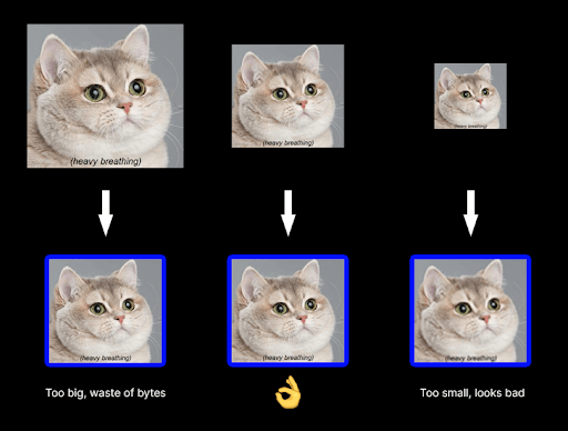
Why should you care? The Internet is fast, and mobile devices are powerful enough to process larger graphics, right?
Well, no.
Problem-free mobile internet connection is a privilege for European users. The rest of the world unfortunately deals with connectivity and service range problems. Even in The United States, the birthplace of the web as we know it, finding high-speed internet outside the city can be quite a challenge.
Google knows this. When creating its website index, they take into account how fast a website is running. Sites that require fewer bytes to download appear higher in the search results. Google wants Internet users to find websites that load efficiently and therefore are more pleasant to use.
You can’t assume that your app will be fine because it loads smoothly on a broadband connection.
Google, performing its test for mobile devices, slows down the connection to 4G (100 Mb/s) to correspond to real conditions. You can simulate such a test using the PageSpeed Insights website. You will quickly discover that due to the increased requirements, the performance rating is always worse on the mobile than on the desktop version.
Deep dive into responsive images
We know that the img tag displays images. It has the standard src attribute that points to the image file location and contains one address at most. Do not give it up and leave it as the default option – in case someone runs your website in an application without responsive image support, e.g. a PDF generator.
To point the browser to other graphics that should be displayed depending on the resolution of the device, you need to use one or two additional attributes.
The first is srcset which defines a collection of images in different sizes. In the basic version, each entry contains the address of the file and the size of the image, and subsequent entries are separated by a comma.
The number of image versions and their specific sizes depend on the application you work on. I have some tips to follow, and I’ll discuss them later in the article.
Not all pixels are the same
The image size uses the “w” unit (for width) and specifies the physical width of the graphic in pixels as it is stored in the file. This so-called width descriptor is an unusual unit, not found anywhere else – so why wasn’t the traditional measurement in pixels (“px”) used?
Pixels, as we know them from CSS, are a relative unit depending on the screen we use. I’ll use iPhone 13 as an example. In the portrait position, each row of its matrix consists of 1170 light points (i.e. physical pixels). However, were you to check the width of the browser screen using JavaScript, you’d get only 390 pixels, so three times less! This difference? The latter result includes virtual pixels, not physical pixels – measured with the px unit that we use in CSS and JS.
It turns out that browsers, whenever possible, use more than one physical pixel to display a single virtual pixel of a web application. This ratio is called pixel density, and the more physical pixels there are in a virtual pixel, the nicer things look on the screen.
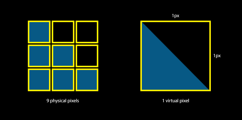
This doesn’t mean that browsers are unable to use the full potential of screens with high pixel density. On the contrary, just like playing movies in our favorite streaming app, browsers try to use every physical pixel to display as much detail of the loaded graphics as possible. Therefore, to show sharp images, you need to load sufficiently large files.
The formula for this is simple:
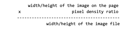
According to this formula, if the CSS defines the image size as 300 x 200 px, and the pixel density ratio (DPR) of a given device is 2, then graphics with dimensions of 600 by 400 pixels will look the best on display (the browser will effectively use every physical pixel of the screen).
However, you mustn’t fall into the mental trap that higher pixel densities are reserved for mobile devices. Screens with an increased number of pixels per inch are also available for desktop computers and laptops (e.g. MacBook Retina). There are also matrices with a pixel density that isn’t an integer (e.g. Samsung Galaxies boasting a 2.625 coefficient).

As you can see, the term “pixel” can be very misleading in the context of graphics. Remember, you can always check the DPR of your device programmatically by calling window.devicePixelRatio in your script or in the browser’s console.
srcset attribute
Let’s return to our mysterious “w” unit.
The creators of the responsive image specification recommended using “w” to clarify it’s about the absolute number of pixels in the image file, not a tricky screen size in pixels.
There is however another way to store a list of images in the srcset attribute – listing based on the pixel density factor at which images should be displayed. It looks like this:
In this case, the browser will check what this factor is for the current device (x1, x2, or x3), and based on this, decide which candidate image to load.
This simplified format should be used if a given image takes the same size in CSS with all resolutions (e.g. avatars in comments). Then the size of the required versions depends only on the base image dimensions and pixel density on supported devices (e.g. x2, x3).
In the aforementioned example, if the default URL is a 200×300 pixels image, the next two candidates should be 400×600 and 600×900 pixels respectively. In srcset you don’t have to provide the base image x1 – one with the src attribute is considered to be such. This is different from using width descriptors (“w”) that cause src to be completely ignored.
Moving forward in this article, we will only use the srcset versions with width descriptors. They are the most often used in real web applications, where the sizes of images are related to the sizes of screens.
Sizes attribute
You may have noticed that in the first code snippet, we added the sizes attribute to the image. It is a required list of candidates marked with width descriptors, and its task is to tell the browser which version of the image to load depending on the size of the screen.
The reason behind this solution?
The width of the displayed images is usually determined by CSS styles, loaded in separate sheets. If the browser were to choose which image to load only based on CSS styles, then before doing so, it would first have to download all the CSS and JS files to know the display size of each graphic on the screen.
This approach would be counter-productive – instead of loading the image right away and displaying a working page to users as soon as possible, the browser would wait for files that have nothing to do with the image!
The sizes attribute comes in handy here – during HTML rendering, it tells the browser right away which candidate will be best for a given screen resolution.
The browser always knows what the screen dimensions are and what the pixel density factor is. It doesn’t need any additional information, and it certainly doesn’t have to wait for the CSS to load.
The sizes attribute uses the syntax known from media queries. We will put a list of rules in it, separated by commas. Each rule consists of:
- a condition under which it is activated,
- size of the image if this rule is active.
The exception is the last rule, which consists only of a dimension and is automatically activated when no previous condition has been matched!
We can think about sizes as hints to the browser about the image size on the screen when all styles are loaded.
In the most trivial case, the above sizes may result from such CSS content:
However, in real applications, the dimensions often aren’t set directly and may result from your entire website layout.
For example, the content of your website on a desktop occupies a maximum of 1280 pixels, divided in a 5:1 ratio between the main content and the sidebar. What will be the size of an image that fits 100% of the larger block’s width? Without sizes, and all the CSS loaded, the browser couldn’t figure it out. With sizes, the browser knows immediately that if only the screen width is greater than, say, 1280px, then the given graphic will be displayed at 1024px lengthwise.
Of course, media queries placed in sizes don’t boil down to measuring the width of the screen only. You can benefit from all the possibilities offered by media queries in CSS and, for example, load the appropriate image depending on whether the screen is horizontal or vertical.
Keep in mind that once the browser loads a larger image, it may not go back to the smaller one. This can be the case when users rotate their phones to switch the browser from horizontal to portrait mode.
Once the browser knows the width of the image on the screen, it’s only a step away from selecting the appropriate candidate from the srcset list. The browser only needs to multiply the width in px with the density of pixels and thus obtain the size of the needed graphics. If an image with specific dimensions is not available, the next larger one will be loaded.
The table below shows what images browsers loaded depending on the device for the previous example:
| Screen width | Image width on screen (based on sizes) | Pixel density factor | Best image size (based on srcset) | Selected file |
| 390px | 128px | 2 | 128 x 2 = 256w | image_256.webp |
| 960px | 256px | 2 | 256 x 2 = 512w | image_512.webp |
| 1920px | 1024px | 1 | 1024w | image_1024.webp |
The right order of rules in sizes matters!
The rules are verified one by one, and the check-up of the conditions ends when the first condition met is found. Therefore, if your conditions are based on min-width checking (similar to the mobile-first approach in CSS), then the rules should be sorted from largest screens to smallest.
✅Correct (min-width: 1024px) 300px, (min-width: 760px) 640px, 540px
❌Incorrect: (min-width: 760px) 640px, (min-width: 1024px) 300px, 540px
In the correct example, on an HD screen (which are 1920px wide), the rule points out to 300px wide image (1920px > 1024px). However, if you use the wrong order, the 640px image will be loaded, because the browser will stop checking after the first positive result (1920px > 760px) and won’t move to the other ones, even if they make more sense.
A possible solution here is reciprocal constraints, ensuring correct operation even if you accidentally mix up the order: (min-width: 1024px) 300px, ((min-width: 760px) and (max-width: 1023px)) 640px, 540px.
That’s it for the theory, time to put it into practice.
How to choose dimensions when implementing responsive images?
Unfortunately, not that easy.
Creating files for ALL possible screen widths is just absurd. They can be arbitrarily generated on demand when the browser asks for them but sometimes this isn’t technically feasible. Besides, issuing an endpoint that scales images to any size can be abused by people with malevolent intentions. Yes, storage space is cheap, but that’s overkill.
When choosing the sizes of graphics, you must follow your breakpoints and devices used by your users. There is no single solution that fits every case. Guides that simply tell you to use next/image without the proper parameters refinement are pointless.
So, for our example, we’ll use a page consisting of the following CSS and HTML code:
The displayed image has no added sizes and srcset attributes yet. I’ll show you how to do it, step by step.
Start with the largest screens
They are easier to use because of the fixed-width layout. CSS shows that on screens measuring 1200px and more in width, your div that includes graphics is always 1200px horizontally. There are no spaces or margins, so it’s easy to deduce that the space for the room in the middle will also be 1200px.
It is not always so easy to calculate. In more complex situations, use developer tools and download the current size of the img element from there. See the screenshot below.
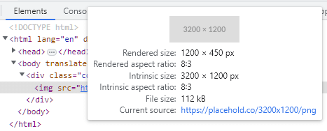
In Chrome DevTools, if you hover over the image, you will see a tooltip like the screenshot above with a lot of interesting information:
- instrinsic size is the real size of the currently used graphic (sizes in the file).
- rendered size is the dimensions you look for, i.e. how much space the image takes up on the user’s screen. In this case, the cover div restricts the image to 1200px horizontally, as predicted.
- rendered and intrinsic aspect ratios allow checking if the shown image is not cropped or distorted and has the shape we do expect.
- file size allows you to quickly verify the reals size of the image in kilobytes.
- a current source informs which image version the candidate is really rendered. It will be useful for us soon.
Desktops and tablets
With this information, you can expand your img tag. Add a 1200w file to it (line 5). Also, take care of users with screens 144ppi or more (e.g. Mackbook where the pixel density ratio is 2 or more) – it’s worth adding an image with a double size at least (line 4). Finally, tell the browser that on screens with a resolution from 1280px horizontally, your image will have a rendered width of 1200px (line 8).
Your code should look like this:
A similar thing occurs with the second breakpoint, created for tablets and phones with larger screens (e.g. iPhone 12 Pro Max). You’re still dealing with a fixed-width layout, so you need 800w image width. Now you’re entering the mobile devices territory – they often have screens with a density factor of 2x or even 3x – so consider them when expanding the candidate images list (1200w, 1800w).
In the end, you added only two versions to the list (1x and 3x), instead of three (1x, 2x, 3x), as 2x would then be 1200w wide which coincides with the previously added entry (no sense to add the same image again).
Verification
At this point, you may be tempted to test your code and see how the image changes depending on the width of the browser window. It can be done but remember some rules here.
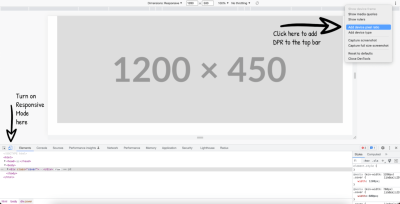
It’s best to start with using the Responsive Mode in Chrome DevTools – they allow you to modify the pixel density factor as well.
After opening the developer tools, you turn on the Responsive Mode by clicking on the small icon in the upper left corner of the panel or by pressing the SHIFT + CMD / CTRL + M keys. At the top, a bar will appear that controls the displayed resolution of your app.
On the left, there’s a list of sample devices with screen simulators. Then text boxes with the current view size, screen zoom, and the Internet slowdown status. By default, there’s no pixel density ratio switch there, so it’s worth adding it by clicking the three-dot menu on the right.
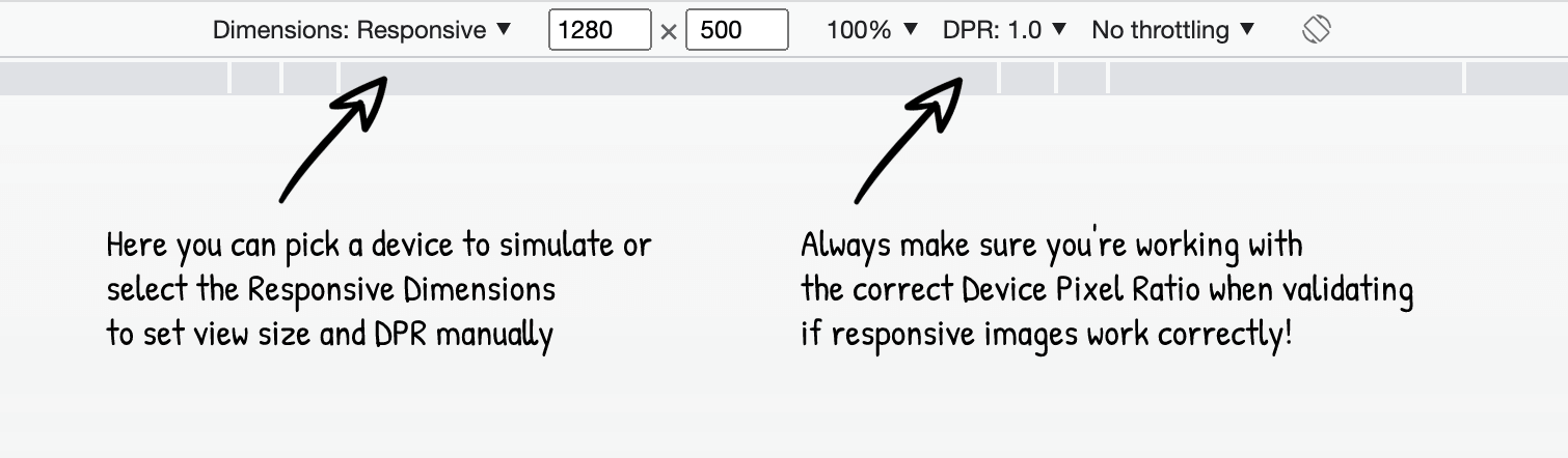
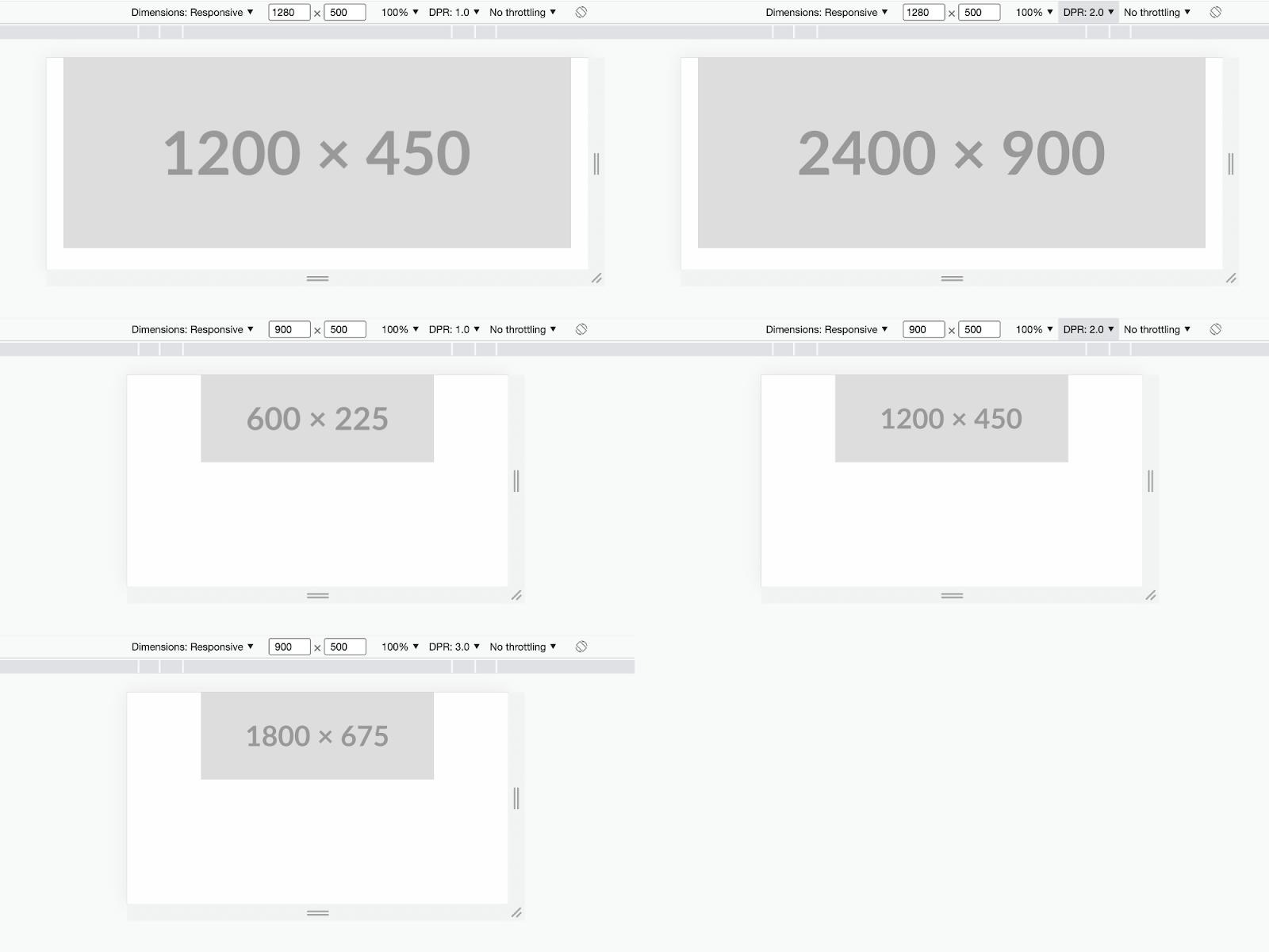
With DevTools set up this way, you can start testing responsive images. For desktop versions, choose “Dimensions: Responsive” from the list of devices to conveniently change the view size by using the handles or entering them manually in the text fields.
It’s crucial to work with the correct DPR, otherwise, the browser may load different images than you expect. For example, on MacBooks with responsive dimensions, the default DPR is 2. A moment of inattention and your calculations might end up wrong.
For this article, I tested all five image display variants that we’ve added so far. Two for the highest breakpoint (x1, x2) and three for the average (x1, x2, x3). Everything worked as planned! In the further part, I’ll link the finished code for you to test yourself.
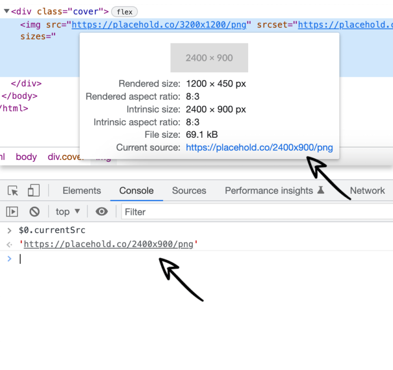
For testing, I used Placehold.co – for URLs with inserted sizes, the tool returns an image with a given resolution displaying sizes as text. It’s convenient to quickly see what’s the size of the graphics being rendered. For actual photos, there are two other ways to check which image has been selected:
- I showed you the first one earlier. It’s that small window that shows up when you hover your cursor over an element in DevTools.
- Another method is to click on an element in DevTools, and then move to the console. This click made the image reference available in the console under the $0 variable. Now you can use it to check the value of the currentSrc field. If any images are uploaded, this field will contain the URL to the selected items.
During testing, it may happen that something just looks… wrong. Before you start nervously changing your HTML code, check if you came across one of the browser optimizations:
- If you loaded a larger image and then reduced the view size, it may happen that the browser won’t load the smaller graphic and will continue to return the higher resolution.
- Even if you reload the page, a larger image from the browser cache may still be displayed. Disable this mechanism in DevTools (Network > Disable cache).
- Just to be sure, refresh the page every time after you turn on the Responsive Mode in DevTools, change the simulated device, or manually modify the view size or DPR – this way you won’t run into false positives.
Cursed mobile devices
Now it gets interesting – devices with small screens! Here your layout has a variable width and the image takes the size of the device. As I mentioned before, it’s not difficult to have a separate image for every possible size, from 1 pixel up. The art is to decide on specific dimensions and find criteria to choose them best.
The best solution is to check what devices your users really own!
The easiest way to find out about your users’ devices is to research information on the most popular smartphones in your target group. You can search for devices per country, age, etc. So if your app is going to be used by children from the USA, you should definitely look into screens of low-end devices. If you aim at teenage influencers, then you will probably focus on Apple products.
If your website is live for some time, and you want to optimize it, it’s worth using the statistics you have already collected (and you have, right?). Google Analytics provides reports about technologies and technology-related details with a breakdown of Device Models. For an even better view, filter the “only mobile and tablet devices” category.
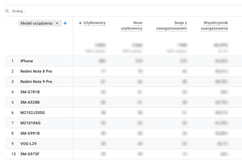
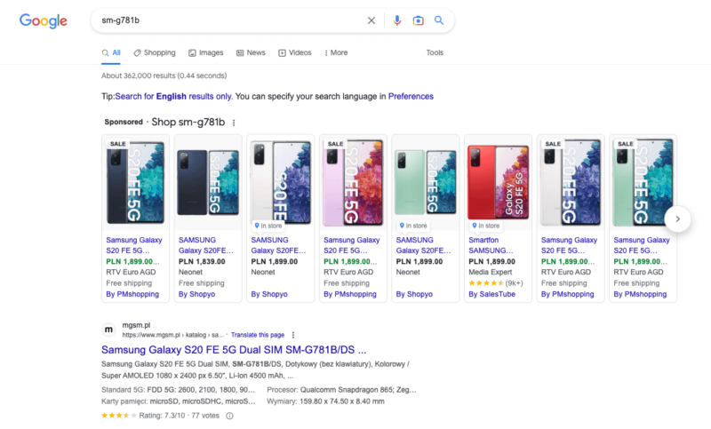
It’s basically a list of devices that most often visit your website. Some of them may look strange – it’s the manufacturer’s code, not the marketing name. You can decode such a name by typing it in Google and carefully comparing it with official websites/stores that often will list those codes.
Regardless of what devices you ultimately add to your list, you must not forget about the most important of them – Motorola Moto G Power. That’s right, tools like Lighthouse or PageSpeed Insights always test mobile apps based on this phone’s screen. Google, the creator of those testing tools, used to own Motorola, so that explains why this particular device was chosen. So if you want to optimize your app successfully, don’t forget about the teeny tiny screen of this popular Motorola.
In the ideal situation, you should try to display good-quality images on as many smartphones as possible. In practice, about five most popular devices are chosen.
A lot of devices of the same series share browser view widths, so it makes sense. There’s no perfect number here, everything depends on your users and technical capabilities. The more sizes you support, the more complex the code becomes (more to maintain). So analyze which devices you should support with perfectly fitted images, and which could get a larger format for self-scaling.
Let’s say you chose to prioritize three mobile devices: iPhone 14, Xiaomi Redmi Note 8 Pro, and of course, Motorola Moto G Power. Now, simulate these devices in the browser to check the rendered size of your images. In this case, the image has no padding and margins, the phone screen width equals the image width. In real apps, however, this can be much more complex.
How do you know how big are browser views and DPR on these devices? Some are predefined in DevTools but you won’t find all phones there (especially the brand-new ones). So the rest of the info you have to figure out yourself.
The easiest way to do it is to Google the device name for technical specifications. Your browser’s resolution may be called “logic resolution” or “viewport size”, and DPR – “ratio” or “scale factor”. I highly recommend the Yes Viz website.
Via this website, you will establish the following data:
- iPhone 14 – 390 x 844, DPR: 3
- Xiaomi Redmi Note 8 Pro – 393 x 851, DPR: 2.75
- Motorola Moto G Power – 412 x 823, DPR: 1.75
It’s worth adding them on the list of predefined devices in Responsive Mode in DevTools (won’t have to enter them manually every time). It’s simple, just check out the screenshot below:
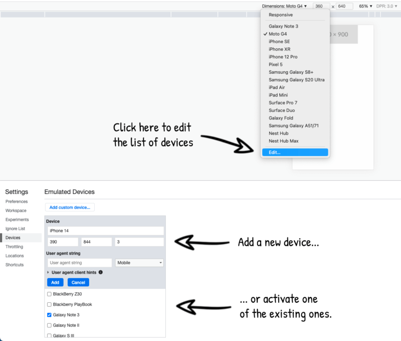
The next steps won’t be much different from what you did with desktops and tablets. You display your app in a view with the right size (by entering it manually or by simulating a specific device), download the size of the rendered image, and taking into account the device DPR, add it to the graphics HTML code.
Be cautious when writing media queries for the sizes attribute. The best way is to start from the bottom, from the smallest device, and define how the image renders there directly (390px). Then go to the next smallest device and write the media query, so the image for this device is shown from that device’s screen size (393px) up to the next one ((min-width: 393px) 393px). Repeat it for all the remaining phones and tablets and this way, you will serve the best graphics not only for the devices you support but also for those, you don’t cover directly.
It will be easier to understand with data in a table.
| Device | Screen width | Image width | DPR | Graphics width | Media Query |
| Motorola Moto G Power | 412px | 412px | 1.75 | 412 x 1.75 = 721w | (min-width: 412px) 412px |
| Xiaomi Redmi Note 8 Pro | 393px | 851px | 2.75 | 393 * 2.75 = 1081w | (min-width: 393px) 393px |
| iPhone 14 | 390px | 390px | 3 | 390 x 3 = 1170w | 390px |
Translating this into code language and adding to the image you created earlier, and you get the final version of your image:
So far we have applied all the responsive images rules quite precisely. But if you’re more proficient, and you only want to tweak results in Lighthouse or PageSpeed Insights (based on Lighthouse running in a controlled environment), you can try some shortcuts. More about them later.
Lighthouse score success checklist from my colleague:
Bigger picture
Some readers may be disappointed with this code – graphics addresses for different screen widths are mixed with each other and are not in any obvious way related to the media queries for which they are to be displayed. This makes maintaining code difficult, expensive, and possibly problematic for developers who will take over the application after you in the future.
There’s an alternative – tag picture in HTML. Less popular, but just as powerful.
To demonstrate how it works, I rewrote the previous code into a picture tag:
Tag picture has no special attributes, everything important happens inside it. Put the img tag in it – that will be your default image (for solutions not supporting tag picture), and one (or more) source elements. Each source corresponds to one breakpoint. Enter optional media query in the source media attribute, and the images assigned to it in the srcset attribute. Now, list comma-separated candidates consisting of a file path and a size descriptor (in a “w” unit, or as pixel density factor, e.g. 2x).
To select an image, the browser searches for the first source element that has the media query met (or has no at all), and then, based on the DRP factor, it finds the best candidate sources in the srcset.
Tag picture or srcset & sizes. Which solution is better to use?
Both perform the same task, so it really depends on you.
The tag picture is less popular but definitely more readable and easier to maintain.
Srcset & sizes in img methods are used by all solutions built into frameworks. Generating attribute values by an automated script is faster to implement than creating many individual source elements.
My advice? If you’re not a bot, use a tag picture. But if you like source sets, that’s fine too.
Corner-cutting & problem-solving
Lighthouse creators are aware of phone model variety with different screen sizes and pixel density factors. There’s no point in creating a thousand images, so to shorten the seemingly long list above, look at the Lighthouse source code, and simplifications you can afford.
Browsing the file with the logic for auditing image sizes, you will notice that when Lighthouse checks if your graphics don’t weigh more than they should it assumes some margin of error. Interestingly, this error margin is larger if you use srcset or the img tag. For a bare image it’s only 4kB. If you made an effort to optimize, it increases to 12kB. The sheer number of redundant bytes is determined based on the image’s pixel ratio, and how many pixels a perfect image would have to render.
Conclusion? Don’t worry if your graphics are a few pixels higher or wider than their space in the page view. Rounding in size scaling won’t be a problem. 12kB is 8 rows with a width of 512 pixels each (assuming the RGB format and simplifications).
Further, in the same logic file, you’ll learn that this audit completely excludes certain types of files from being examined:
- SVG vector graphics. Due to their nature and the possibility of free scaling, there’s no need to create their versions for different screen widths. SVG should be used whenever possible anyway – takes up little space, and can be freely reduced and enlarged. Perfect for icons and geometrical shapes. When used correctly, with SVGs you can avoid dealing with responsive graphics.
- CSS-attached images. Backgrounds, or clipping masks. Due to the multitude of ways in which CSS graphics can be used, verifying correctness would be too complicated and burdened with errors.
Use audit exclusions when you are unable to perfectly match the size of the image to the view space.
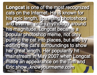
I’ve got a Long Cat example here. This is a div with height depending on the user-entered text length. You may be tempted to display the background image using the img tag and position it with position:absolute to be detected by search engine crawlers. But then you’ll discover there’s no simple way to determine the necessary height of the image – since the content is variable, the height of the background image is also variable.
The workaround for this is to display the image in its entirety, simply using the background-image CSS attribute. Just remember not to make the picture too big. You won’t crop it, and you don’t want to show the HD version if the div is small. Yes, it will no longer be visible to search engines, which is bad for general SEO and accessibility, but at least your site won’t suffer in PageSpeed Insights tests. However, try to avoid this solution at all costs and consider cropping the text or using a different design approach. Especially if the image is important, and it may be crucial for people using screen readers to access the image’s alternative text.
Other exceptions in Lighthouse’s code
If the image is displayed at a size of zero by zero pixels, the audit won’t punish your website as long as the image file is not wider than two screen widths. You won’t lose points for too large an image if the same file is also displayed elsewhere on the page and fits there the space it occupies.
Something interesting also happens in the audit checking whether the images in your application are not too small. Its creators found out that there’s no sense to support a DPR value as high as 3 because whether we display a double or triple-detailed image is indistinguishable to the human eye.
In this audit, DPR is “rounded” down to 2, 1.5, and 1. In practice, this means that you can sometimes afford the application to display graphics with a lower resolution than the device is really able to display. For example – if the DPR is 3, the test checks your application as if it were 2, and thus will allow fewer weighting images. This also helps with handling devices having exotic DPR values like 2.652 because you can simply treat them as e.g.: 2.
Final tip! Always keep in mind the most important thing – your site should not only score well in Lighthouse but have great performance on your users’ devices. “When a measure becomes a target, it ceases to be a good measure”.
All shortcuts provided in this article are useful but aren’t excuses to cheat and worsen the user experience. Your ultimate goal is a working solution with beautifully presented images.
Responsive images. Summary
I hope that after reading this text you are armed with all the theoretical and practical knowledge about responsive graphics. The knowledge about responsive graphics is widely dispersed on the Internet, so I wanted to collect it and prepare you for this journey so that you don’t have to pave the trail that many before you have traveled with difficulty.
Finally, I’d like to drop a link to Cloudflare Image Resizing (unfortunately, paid service) for generating images on demand, in any size, without storing them on your server.
I congratulate you on your reading perseverance and wish you many successful image optimizations! If you see anything interesting, have questions, or notice something to improve, please give me a shout via Twitter, and I’ll try to help with any concerns.
We will fix your problems with performance
The Software House teams have impeccable experience with responsive images. Every web-facing application we create and publicly release is customized and tough as nails. Tell us about your issues and we’ll come back to you with 1-h tech consultations free of charge.
