30 March 2023
Walkthrough: UX design for a new training platform for 92K teachers
Software products will always be judged by users based on their look and feel. If you are a market leader about to introduce a new service that will further consolidate your position, you must think of a fitting product design. We had the best of luck working with a partner that perfectly understands that this is a fact, not an opinion. See how we established a trailblazing Akademia Librus – the first of its type online platform for teachers training for the biggest company supporting educational needs in Poland.
About Librus
Librus is the leader in providing all-purpose software for the Polish education system, constantly set to drive trends, and innovations and implement new solutions. Their services include electronic class registers used by 4,9 million parents and students and 310 000 teachers in 8200 schools, and platforms for 1,700 local government units.
The company has also been organizing courses for teachers for over 20 years. Annually around 92,000 participants improve their competencies with Librus workshops. The Librus Teacher Training Center consists of over 110 educators-practitioners who share their knowledge throughout Poland – from tiny villages to big cities.
Project background
…and then Covid-19 hit.
Once the new pandemic rules were introduced, The Librus Teacher Training Center couldn’t function in its previous form anymore. Teaching is one of those professions that require constant learning, so taking away a rich source of knowledge for almost 100K current and prospective teachers a year wasn’t an option.
So the company decided that in this new reality, an online training platform is an absolute must for their educational software portfolio.
After analyzing the market and available options, Librus was 100% certain that they wanted to create their own training platform. They started the work themselves but it quickly turned out that the workload was massive. The initially developed designs were acceptable but, both in terms of usability and visuals left a lot to be desired. Librus dreamed of creating a “Netflix for teachers” so in order to squeeze the highest quality possible they decided on joining forces with a technological partner. Yes, little old us! 🙂
The problem and challenges of the design process
The main problem for us to solve was effectively moving all of Librus’ training resources online.
Project requirements from Akademia Librus:
conducting a detailed audit aimed at eliminating as many pain points as possible
During an audit, we search for all things that are not in line with good UX practices, and accessibility. Moreover, we test business requirements, and if necessary, suggest more appropriate solutions. Such an audit consists of scanning the entire content, pointing out irregularities, and adding suggested changes.
creating user paths tailored to the average age of users
The initial research showed that 45 years is more or less the average age of teachers in Poland, so we had to keep in mind that the platform will be used by people who might not be proficient in technology.
basing UI on the provided brand book
Librus had an already established brand book where the color palette, typography, graphic motifs, and key visuals were described. Therefore, we had to follow these guidelines so the Akademia Librus design matched these assumptions, e.g. if the default font is Open Sans, we had to stick to it and couldn’t use Roboto, Barlow, or any other instead. It was a good exercise for our creativity, and eventually, it made delivering the expected results easier.
working in Adobe XD
Adobe XD was quite difficult to work with due to its infamous failure rate but when clients demand it, we are even willing to ditch our beloved Figma. Understandably, Librus wanted to get the whole project in this app so they could edit things on their own if needed later.
User research
From the beginning, Librus had a clear vision of their own Netflix/YouTube for teachers. However, we quickly realized that these platforms cater to users looking primarily for entertainment, and casual content. Yes, there are lots of high-quality educational channels but considering Librus’ established reputation in providing the best educational solutions for Polish education, we couldn’t afford any associations with questionable quality content or lack of credibility – even on the visual and usability levels.
Akademia Librus is a completely professional training platform with a very narrow target group (educators). The YouTube idea was good but not perfectly aligned with the needs of the target end-users group. An important element was to emphasize the expertise of lecturers and the relevance of resources. The participants must be sure that they are provided with the highest quality knowledge that will broaden their professional competencies.
So our first task was to extract the essence that would coincide with our teacher/lecturer persona.
We’ve used surveys addressed to teachers about their preferences regarding the newly created platform. The answers were so crucial that we had to slightly reorganize the previously established course of the whole process. But hey, we work in Agile, so had no major problems with it!
To solve some problems, we suggested moving towards Coursera/Udemy direction but condensing the scope to cater to an even narrower target audience (teachers) and their particular needs. However, we added a pinch of social features – e.g. ratings and comments of workshops (gives Librus immediate feedback on their resources).
During the audit, we discovered that the initial plan had a lot of discrepancies in terms of accessibility. Our persona included people older than 45 years, therefore typography size, clickable elements, contrasts, etc. were crucial, and desperately needed to be unified.
Wireframes & User Interface
After the user audit, and workshops with the Librus team to define the scope, we started modeling functionalities according to the previously prepared plan.
Our design team used high-fidelity wireframes with a description of individual flows and functionalities while preparing mood boards presenting the potential graphic style in which the above-mentioned functionalities would be “wrapped”. The challenge was to develop a distinct graphic “feel & look” that would coincide with Librus’ style guide and blend perfectly into clients’ catalog/portfolio. At the same time, The new version is updated, modernized, and facelifted (or should we say UI-lifted) according to current demands not only for usable but also plausible visual solutions.
Psst! Wanna hear a little secret? According to the studies, e.g. “Effects of Design Aesthetics on the Perceived Value of a Product“, “high–design-aesthetic products induced positive emotions […], design aesthetics improve product value from a neural science perspective.”
So it’s just a matter of fact that good-looking products are perceived as more valuable and useful than their messy competition.
So, after analyzing the contents of Librus’ brand book, we prepared a few proposals for graphic directions in accordance with the predefined style of the brand, and together we picked the final version.
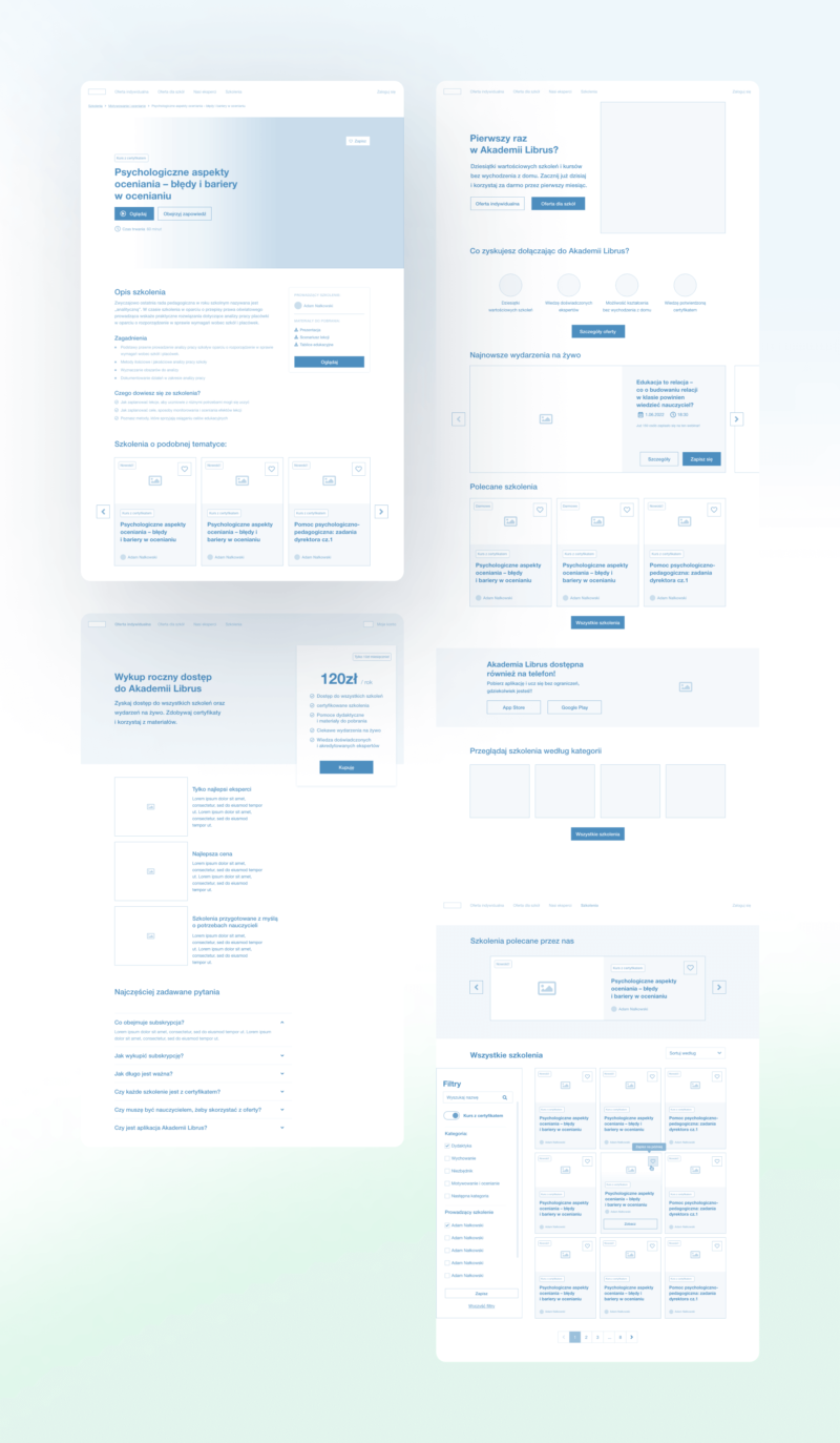
High-fidelity wireframes (shown in the picture above) allowed us to prepare previously proposed and approved usability solutions for the entire application. This way we had enough space to try out and discuss different ideas and approaches before settling on the chosen ones.
We can’t recommend wireframes enough. They’re super quick to make and perfect to move and change the elements around. Because we tested various options in advance, we were sure from the very beginning that the provided functionalities coincided with the best UX practices and end-users needs.
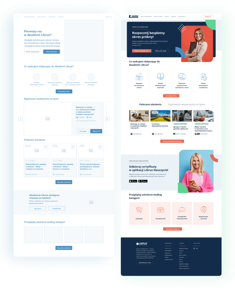
Comparison of mockup and the finished UI of the home page. You can clearly see how wireframes are stable basis and make it easy to complete the design.
Design system & features
Once a week we had a review meeting, where we discussed the current state of work in detail, and received feedback from stakeholders. It turned out to be very beneficial. During the first sessions, a custom design system emerged and we set to prepare final functionalities using pre-prepared elements and components.
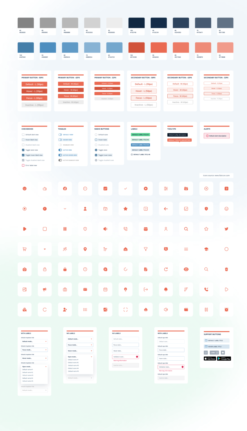
Here you can see the snippet of the custom components library, aka. design system – a collection of simple and more complex graphic elements for multiple uses during the design process. Thanks to an established design system, Akademia Librus gains extra speed of execution without losing any quality or consistency.
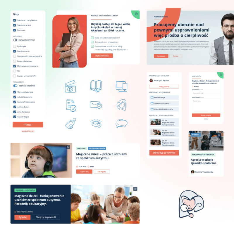
Additionally, we thought about future-proofing the platform as far as customized components are concerned. This includes modals, filters, and icons that we used in various places around the project. These are also an integral part of the entire design system which means they may be easily re-used depending on what future improvements Librus plans for the platform.
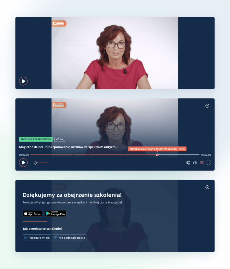
The core functionality was a custom player for displaying video files. Later in the project, we also added a few components, e.g. possibility to add notes, and a list of chapters that consisted of individual pieces of training.
Later consultations during the development stage resulted in adapting the web design to the mobile application too.
When everything was settled, a team of three product designers and the project manager, started the whole process by preparing information architecture. Detailed tasks were set in the Jira management tool, and divided among team members depending on specializations, qualifications, and competencies.
UI/UX portfolio of the finished Akademia Librus platform
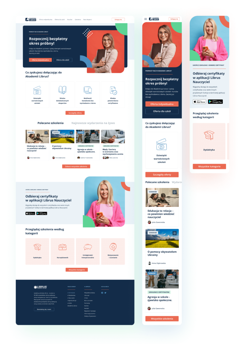
Voila!
This is the finished product – homepage UI in desktop and mobile versions including all the functionalities previously prepared and discussed with our partner:
- creating and managing user accounts either the traditional way or using teacher’s vouchers obtained in their school,
- browsing, managing, and participating in online courses – prerecorded, on-demand, and live webinar sessions,
- user-friendly, fully-fledged course video player, allowing to focus on e-learning.
Not to mention, the Akademia Librus platform looks outstanding now!
Make sure to check out the animation below for the full feel&look. 👇
Talented people responsible for this animated gem:
- Lead designer: Aleksander Chmura
- Project management: Piotr Baran
- 3D scene: Dariusz Dzierwa
- Animation: Przemek Gacka
"They did their best to overhaul how the website works for people" - PM @ Bahr
Project benefits
Akademia Librus is the very first Polish platform of this type, so it’s a trailblazer in virtual educational training. Even without any previous blueprints on the market, we managed to successfully design and deliver an online learning platform for teachers without much slippage. The biggest benefit for Akademia Librus is their forward thinking and innovation – as the first in the Polish market, they will be the company to beat if any “other” competitor arises.
Customer feedback
The entire process was a complete success, as evidenced by a positive opinion from our partner and their willingness to continue cooperation in the future!
We are delighted to cooperate with The Software House and their UX/UI specialists for our Akademia Librus platforms. The team was always open to suggestions and provided us with creative options. Our work results in a design system that meets our expectations by 100% in terms of functionalities and aesthetics. We are in awe of the high-quality performance of the TSH team, and we plan to cooperate with them on future projects.”
Now all Akademia Librus has to do is monitor and analyze the rising user traffic on an ongoing basis. 🎉
Users take about 0.05 seconds to form an opinion about your website. Book 1-hour consultations to ensure it will be positive
It depends on great UX/UI practices on whether they’ll stay and become your fan or leave and never come back.
Talk to our Product Designers about how to turn great first impressions into customer loyalty. The meeting is completely free with no-strings-attached. Let’s talk!


