21 October 2021
Dealing with design challenges any online marketplace can have

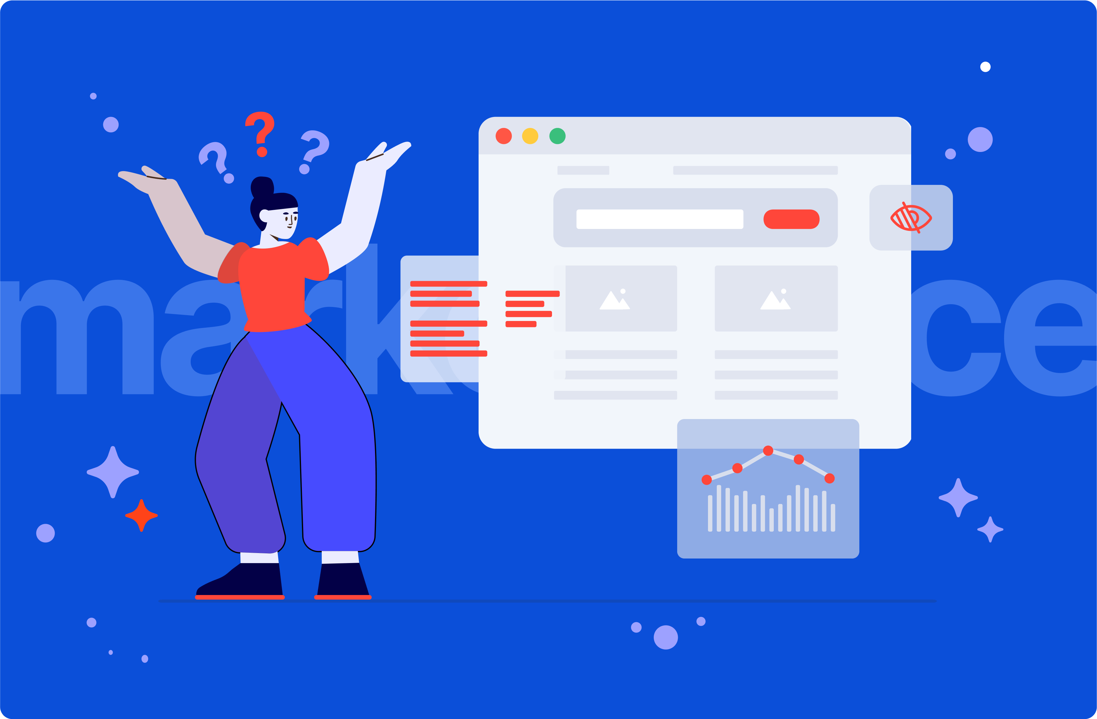
Low growth or a low retention rate can halt a marketplace’s success. Businesses tend to dominate in fishing for customers, but what about keeping them engaged with the product? Discover which design problems block marketplaces from reaching growth in thousands of users, and how the product team can counter them.
Remember how it was to shop for anything other than groceries pre-internet? Asking for recommendations, making a shortlist, and dragging yourself from store to store was too much sacrifice for our kind, I guess.
Amazon and eBay launched in 1995 as one of the first usable-enough sites to let us shop with comfort in our home slippers. The comfort offered by online retail won, and e-stores grew their share of retail sales from 7% to almost 20% of monies. That also let me find a career in the creative industry as a Product Designer.
Back in the 2000s, running an e-commerce store was a clear-cut operation for a business owner. Have some CMS with one design for years. Don’t let users talk much. Be sure transactions work.

Things got better as the world copied the biggest e-commerce sites. Owners added ratings, reviews, and even FAQs. Investors discovered fresh money in letting B2C and B2B users trade on their platform. We call them marketplaces. They’re in demand, but to manage them is a bloody mess.
This is a tale about the challenges of product design for marketplaces that rely on user-generated content and how the product team can combat them. You’ll learn about:
- Designing websites to handle unpredictable content
- What a marketplace must have to be trusted by shoppers
- Which website navigation problems deplete the user base
- Why prospering marketplaces have an R&D team
How online marketplaces work
Thinking about an international marketplace you know, you might name the Amazon and eBay duo or Aliexpress. On their websites, users and businesses sell a garden variety of goods and services to catch the most traffic. Some marketplaces choose their own avenue — Vinted deals with pre-owned clothes and Fiverr with “I will do everything right” digital services. What connects them is extreme dedication to accessibility as e-commerce webpages lose 20-45% of visitors on average.
Marketplaces with easy-to-read design, smooth performance, and low-effort purchasing process reach greater numbers of users. A high volume of purchases — even under low prices — can generate a massive profit, fulfilling the business need No 1. Imagine that Zalando expects over €10.1B in revenue in 2021.
The job of product designers like me is to explore concepts for usability and put the pieces of a marketplace together in an optimal way to feed that revenue growth.
Now the challenge is that websites such as eBay are made of user-generated content or varying quality which changes dynamically. Let’s explore what’s the problem with that.
💡 Here’s how my friend and I turned a design challenge into a force for user growth
Create future projects for users careless about style
The content that people upload onto marketplaces can turn a page into pure chaos. As a business owner, you could expect something like this.

Content sourced from users can cause a lot of UX/UI and performance challenges for marketplaces.
Among the suspects: badly formatted text riddled with mistakes; photos of unpleasing quality that are somehow 10000x10000px and 10MB; mystery or great-wall-long headlines that pollute screens; and waterfall post descriptions stealing our time. We share content without thinking.
It’s better — and cheaper for the budget — to prevent rather than cure. Here are the most common fixes I’ve been introducing in the 13 years of my career.
- Introduce a character limit for titles and paragraphs. Knowing how much of them there can be, it becomes easier to know how much space you need in design for content.
- Either limit the upload size for image files or put them through auto compression. A page with less file weight obviously loads faster, and that’s critical for a service growing in active users.
- The page’s layout should be flexible enough to display user-generated content under a universal format across the marketplace. That combats any friction visitors can have from browsing through pages that don’t look alike.
Designers too often create assets with a ruler in hand, using pristine photos and sharp headlines. They’re forgetting that in the product development process, functionality comes and their wonderful Behance showcase comes second 🙂 Sometimes I even catch myself designing for the looks, and then, the previous challenges I overcame turn out to be the same I have to face in a new project.
My research shows that 99.9% of users aren’t designers. They’re careless about image quality, resolution, size, or what are the writing guidelines for a website.
Product designers need to work with that attitude, creating marketplaces that still look great with low-resolution pictures and rambling sales descriptions that break grammar. Overcoming design constraints is our daily grind. Instead of hoping for perfection, they should work with examples of “bad content” people actually post to shape layouts that can hold such.
The trust signals any marketplace needs
So a marketplace needs legions of active users to reach them millions. Keeping customers in the community is another challenge to consider, especially when people might have an expanding list of demands the more they spend through a website.
Earlier, I said marketplace design must include varying page space for user-generated content. But even with pixel-perfection graphic design and a heist-plan-level growth strategy, a digital product won’t sail for long if visitors deem it untrustworthy.
You’d like your marketplace to introduce “signals” the consumers trust in before the team finalizes the design. Existing products can also get optimized for trustworthiness, but that costs triple!
We live in a time when users rate the quality of the product or service by their reviews. The first mechanism should be a strong review system, which at best includes a ranking with comments for specific items listed on the website and an overall marketplace rating from shoppers.
Then, consider the online transaction process. With a traditional, “hands-on” purchase, you mostly know what you’re getting for the money. In contrast, online shopping is a wild west where you pay first not knowing what you’ll get. As users get uncomfortable with the risks of e-commerce shopping, they always expect a minimal-friction return policy.
I’m a regular shopper at Etsy, AliExpress, Wish.com, or Fiverr who bucks on things of hit-or-miss quality. For now, I’ve burned myself a lot, but thanks to people like me, these four platforms have a stellar transaction security guarantee. I still shop there on repeat, unable to confirm or deny if that’s an addiction.

Considering these two sides of marketplace trustworthiness, the owner should implement the following business-UX solutions.
Considering these two sides of marketplace trustworthiness, the owner should implement the following business-UX solutions.
- Keep reviews clear of bad comments. Since social media empowers anonymous opinion, the buyer/seller cannot afford to operate in a space open for negativity in discussion with no effective user verification system.
- Have a 30-day return policy because it’s a gold standard now. The lack of such disqualifies your marketplace. The reassurance that users have from that gives them the confidence to shop since they won’t be stuck with a cherry on top of a pile of unreturned products. Sure, people abuse that system, but you can’t change human nature without a dictatorship.
- A marketplace’s customer service must mimic in-store help. Even a system with UX/UI designed similarly to a prospering platform can’t be ready for the customer’s confused mind. Steps simple to you can block and enrage somebody else who can trash the marketplace’s reviews with anger.
- A visible and operational customer service is another must-have for an internet business. But say no to chatbots as they make people feel like they’re stuck in line with a ticket at an AI-controlled government office.
🤔 Want to build, optimize, or grow a marketplace?
Ask The Software House for access to product designers who built banks, payment apps, and pet or investment marketplaces. Recommended by 98% of our clients.
If the site’s hard to use, you lose
Business owners concern themselves with money-making rather than the marketplace’s ease of use. But a website that requires too much effort in moving around won’t open any wallets.
Each marketplace should have clearly defined customer personas that represent the behavior the most common users have. With these sets of data, we product designers can shape digital components of an optimal low effort/high reward ratio. That’s called accessibility.
It’s a subject for a much longer debate, so for now, allow me to remind you of the key concepts.
- Searching and navigation should be so easy to use that a child could do it. The marketplace should offer a fast search capability through product categories with inclusion or exclusion options and a ready selection of the most used filters.
- Prepare the design for those who see well and those who don’t. The sizes of elements on the page such as images and videos or text should help people with normal and impaired vision browse with comfort.
- Make on-page messaging helpful. Copywriting for the user interface should be straight and informative rather than cool to help minimize browsing confusion.
- Choose eye-pleasing tones for the user interface. The color palette is best with muted colors and notable contrast to reduce eyestrain.
- Each page should have a “street sign”. The navigation bar and markers must help users understand where they are at all times, especially because marketplaces expand without the maintenance from a digital road service.
- Sofa shopping brings a good cut of sales. The website needs mobile-first design (be it RWD, PDA, or a native app) to maximize profits.
- If you think if the user needs instruction somewhere, they probably do. Information bars, modals, or tool-tips with advice should appear in places that can cause mass despair to explain how the more challenging processes work.
- Buying from the website can’t hurt. Remember about having a smooth and fast transaction process from adding an item to the cart to payment processing.
💡 Open this in a new tab to learn why accessible products succeed
Monitor use, then add or remove features
We went through handling dynamic content, building a system worth trusting, and making it all understandable like the concept of a wheel. You probably have a feeling we’re not done, right? Well, whatever a marketplace is made of can’t stay the same forever.
User habits can change in a matter of months. It only takes a brand like Amazon to introduce a breakthrough that boosts purchasing decisions — could be standardized 360° product videos — and your customers will expect the same from you if they’re asked to visit. They might not tell you, though.
A marketplace owner must keep scouting the market to find site improvements people clearly want. In my opinion, there’s a one-year window to introduce a feature before traffic dips, and if it’s done sooner, that traffic can lift off.
Whereas the lack of innovation can be the last nail in a marketplace’s coffin, a gun-ho feature development or a business model shift that affects the page with a bang can be hurtful.
Research & Development people like to add popular stuff for growth, forgetting that removing performance-heavy or unused elements is also a good upgrade.
Think of Facebook that does exactly that for their marketplace launched in 2016. It’s still standing, with a filled business belly, even though experts offered grim future predictions.
Facebook Marketplace must have a full-time team on its payroll that chooses the optimal direction for growth to add what the community requires and to remove clutter.
Speaking of website changes — you must have raged at a digital product before, thinking “YESTERDAY, THIS BUTTON WAS UP, AND NOW IT’S DOWN, THEY’RE CONSTANTLY CHANGING THINGS!”. If you can remember one thing, then keep in mind that it’s ideal to test new features with a focus group before release. That’s how you can really know if something’s worth a shot. The same goes for excluding old features, which you can put through a mass email vote to see if people still care. Try it for personal projects.
💡 Communication - No. 2 among crucial skills for creative industry professionals
Marketplace owners must care more
The e-commerce market passes through changes with the speed of a Japanese bullet train. Marketplaces are challenging to build and maintain for that very reason, so the only way toward bottom-line success is to work by the strategy book.
Today, you’ve learned about the four key chapters: creating flexible design; trust-building; offering accessibility, and controlling the direction for growth. That requires thinking agile, where you assume the plan should be executed in short sprints with a retrospective meeting about the state of the product.
If you feel that’s unnecessary, at least accept that’s what the top 10 companies in any westernized markets do. So if you want the balance to go above the spending line, you need to make new commitments. As Gordon Gekko from the “Wall Street” movie put it — It’s all about the money.

